In need of a few call to action examples to use as inspiration for your next marketing campaign?
Every landing page needs a solid call to action to help drive sales and increase conversions.
In this post, you’ll find a bunch of call to action examples organized by type. And a breakdown of why each one works so well.
What is a call to action?
A call to action is the marketing term for the part of a landing page or form that strongly encourages potential leads or buyers to take a desired action, which is usually to complete a purchase or sign up for a website’s email list.
The reason it’s named “call” to action is because you’re calling your lead to take a specific action.
Here’s a simple example from the primary landing page for Apple TV:
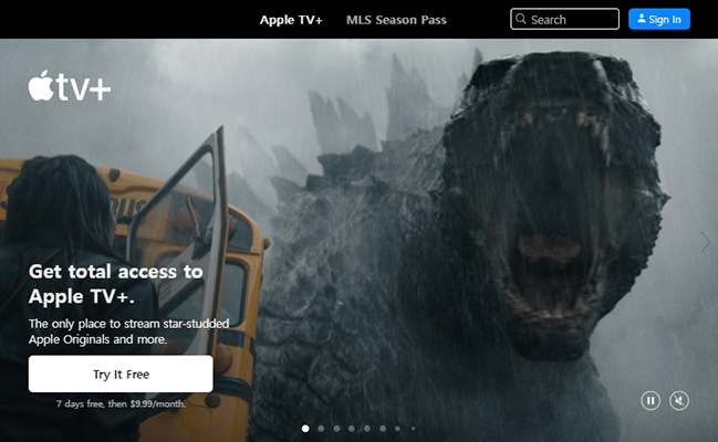
The hero section of the page has a slideshow in which the first slide is a montage video of movies and shows the streaming service has.
The call to action is located in the bottom, left-hand corner: “Try it Free.” Clicking this button takes you to the streaming service’s signup form.
The call to action (CTA) even follows you as you scroll down the page as a floating bottom bar.
Why use CTAs in marketing?
So, why should businesses use CTAs on landing pages? Why wouldn’t Apple just put a simple “Subscribe” or “Start Free Trial” button in their menu?
It has to do with conversions, or more specifically, conversion rates. A page’s conversion rate is the number of conversions (subscribers in Apple TV’s case) a page receives divided by the number of visitors a landing page receives times 100.
So, if the Apple TV landing page receives 500,000 visitors and 15,000 of them subscribe, Apple’s conversion rate for that page would be 3% because 1,500 divided by 500,000 is 0.03. Multiplying that number by 100 turns it into a percentage, which is 3% in this example.
This means out of all of the visitors that landing page receives, Apple can expect 3% of them to convert into subscribers, hypothetically, of course.
All businesses should record their conversion rates for the most-visited landing pages on their site, then use CTAs to improve those rates.
You can even tweak CTAs ever so slightly to optimize them.
For example, Apple TV inserted this text beneath their CTA button: “7 days free, then $9.99/month.”
They probably used a conversion rate optimization tool to see where they were losing potential subscribers between their initial call to action and their final “complete signup button” and discovered that most leads were leaving when presented with the subscription’s actual price.
By answering that question at the CTA stage, they can increase their conversions by addressing buyer concerns upfront.
Types of calls to action
Let’s talk about CTA types. Specifically, the types of calls to action we’ll be providing examples for throughout the rest of this article:
- Lead generation form – Part of a landing page that’s used to capture leads.
- Download/try now/buy now button – Used for direct purchases, free trial redemptions and purchases. You can also use this to offer a free guide or free proposal, but you may be better off using a lead generation form in that instance.
- Submission form – A contact form used to generate leads or feedback.
- Pricing table – Used in multi-step sales funnels in place of a direct Buy Now button, usually to visually depict the differences between multiple pricing plans.
- Contact sales button – For encouraging potential customers to get in touch with your sales department.
- Learn/view more button – Another possible stage in a multi-step sales funnel. Usually leads to a product landing page or Features page.
These CTA types are used in some of the most common digital marketing strategies used by marketers across all industries.
The call to action examples we showcase in this post are collected from real-world landing pages used by real companies like Minimalist Baker, Panda Express, Kit (formerly ConvertKit) and Master Lock.
All of these companies are successful in their respective industries, so it’s worth learning a thing or two about a key function each company uses in their marketing campaigns.
The best call to action examples to use to improve sales
1. Lead generation form
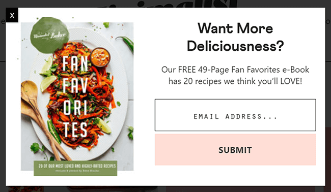
Here’s a call to action example from food blog Minimalist Baker. It’s a lead generation form.
This one in particular appears as a lightbox popup (also called a modal popup) when you first visit a blog post on the blog’s website, meaning the form displays over the site’s main content, which appears dimmer until a visitor completes the form or closes it.
However, lead generation forms can also be featured as page sections, inline, meaning they appear “in line” with the body of your web page, or as popups that only appear when you click on a button or link.
They’re one of the most effective call to action examples because they’re so effective at what they do: providing a simple form website visitors can use to join your email list and become leads.
Why Minimalist Baker’s CTA is so effective
Let’s break Minimalist Baker’s lead generation form down into multiple parts, which are:
- Image
- Main heading
- Tagline
- Email address field
- Submit button
This is a typical lead generation form, so what’s so special about it? It’s what Minimalist Baker is doing with each of these sections that make it so effective at capturing leads.
They’re offering a lead magnet in exchange for their visitor’s email address. They aren’t just promising “updates” or a simple newsletter. They’re offering a free ebook:
- Image – An image of the cookbook.
- Main heading – An attention-grabbing headline that promises more of what the blog’s website offers in a simple, three-word question.
- Tagline – Minimalist Baker uses their tagline to provide a brief description of the free ebook they’re offering as a lead magnet.
Let’s talk about the tagline. It says, “Our FREE 49-Page Fan-Favorites e-Book has 20 recipes we think you’ll LOVE!”
Once again, Minimalist Baker uses a simple sentence to describe multiple benefits you’re receiving by signing up for their email list:
- Free ebook
- 49 pages
- 20 recipes
- Recipes that are “fan favorites,” meaning they’ve been prescreened by the blog’s readers and aren’t simply recipes Minimalist Baker themselves think are great. This is a simple way to demonstrate social proof in a CTA.
The final two parts, the email address field and Submit button are fantastic as well: one field for visitors to fill out and a Submit button that’s large, uses one of the blog’s primary colors and contrasts well with the colors featured in the CTA’s image.
Key takeaways
- Entice website visitors to join your email list with a lead magnet.
- Use a high-quality image to depict your offer. It can even be a mockup or graphic.
- Use a main heading that evokes an emotional response and drives anticipation by including power words.
- Do the same with your tagline while also explaining the benefits of your lead magnet.
- Use minimal fields, such as one for your visitor’s name and one for their email address.
- Use a simple CTA button with simple action phrases, such as “Submit.”
Bonus tip: It’s best to avoid using words like “Download” or “Get it now” since the actual download button won’t appear until your new lead opens the email that contains it.
2. Download, buy now and try now buttons
Here’s an example of another widely-used call to action: a button that leads to a product page where customers can purchase or receive specific products from your website.
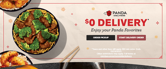
In this case, Panda Express is using a call to action to encourage users to complete a food order.
They’re using two buttons to do it, but those buttons have more or less the same CTA: order from the restaurant. One’s simply for pickup orders while the other is for delivery.
This type of call to action is effective at driving sales for a particular product or service due to the way it draws attention to that product or service.
Why Panda Express’ CTA is so effective
Panda Express’ call to action advertises the restaurant chain’s online order system. These are the primary sections of their CTA:
- Image
- Main heading
- Subheading
- Tagline
- CTA buttons
- Terms and conditions
This is a typical CTA layout for a product landing page to use or even a homepage in which you want to advertise a particular product or service as Panda Express has done with their homepage.
In Panda Express’ version, they’re offering an incentive to encourage potential buyers to click.
Here’s what they’re doing with this CTA specifically:
- Images – Panda Express is using a slider wheel in which three of their most popular dishes are presented.
- Main heading – Panda Express’ main heading is small in this CTA example, but it’s still used effectively. It has a classic Chinese takeout box featured next to the text, “Panda Delivers.”
- Subheading – The restaurant’s incentive is featured in big letters. It says “$0 DELIVERY.”
- Tagline – Panda Express uses this simple tagline to let potential buyers know they can get their favorite dishes delivered for less.
- CTA buttons – The restaurant chain uses two CTA buttons here: one for pickup orders (despite the incentive being for delivery only) and one for delivery.
- Terms and conditions – A simple explanation of the order minimum customers need to place if they want to receive the discounted delivery fee as well as the date when the discount ends.
Like Minimalist Baker’s CTA, Panda Express addresses buyer concerns right in the CTA itself.
Consumers expect order minimums when they buy food online. By addressing that question upfront, Panda Express can increase their conversions.
Plus, knowing when a limited time offer ends is enough to incentivize consumers to actually buy.
Key takeaways
Our first two call to action examples have been similar. So, naturally, our key takeaways are similar as well:
- Encourage clicks by offering an incentive, such as a limited time discount.
- Use a high-quality image to represent the product, service or final result your customer can expect to receive.
- Use a main heading and subheading that promote your product and your incentive with catchy, captivating phrases to create a compelling CTA.
- Save additional benefits for your tagline.
- Use a short and descriptive call to action button, and use two if the situation calls for it.
- Address buyer concerns with smaller writing at the bottom of your CTA.
3. Submission form
This is one of the better call to action examples for service-based businesses. In fact, the submission form call to action is a great CTA type to use for services.
It can also be used for feedback.
Instead of purchasing direct products, customers of service-based businesses pay invoices, which are typically different for each client.
Additionally, each client has a different set of needs the service-based business must attend to, which makes a submission form quite useful.
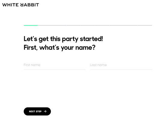
Our example is from White Rabbit, a web design agency based out of Los Angeles.
The agency uses a multi-page submission form for quotes, which asks potential clients about the projects they need help with, including their budgets, services they need and more.
The form also has fields that ask potential clients their name and contact information.
Why White Rabbit’s CTA is so effective
Most submission forms feature all fields on one page, like this:
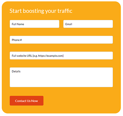
Because White Rabbit’s form is longer, they can reduce how overwhelming it appears to potential clients by giving each field its own page.
The entire form itself still exists on the same “Contact” page, but animations make each field appear one at a time with users needing to click the “Next” button in order to make the next field appear.
This allows visitors to use multi-page forms without them actually having to load each individual “page.”
White Rabbit’s form even has a progress bar, so visitors can clearly see how far along they are in the form.
The form also features minimal colors: other than the green in the progress bar, all other colors are neutral: black, gray and white.
This, combined with the fact that White Rabbit’s form appears as a popup that takes up the entire screen, reduces distractions that may prevent potential clients from completing forms.
Key takeaways
- Use submission forms for feedback and client quotes/requests for a free consultation.
- Consider creating a multi-page form to increase the number of form completions you receive.
- Use one or two colors to place your visitor’s focus on your form’s fields.
- Consider making your form appear as a popup that’s triggered by a button click and takes over the screen to reduce distractions.
4. Pricing table
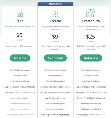
A pricing table call to action is the best choice for businesses that offer one product available in multiple pricing tiers or similar products that have different features and prices.
With more and more SaaS products being released, pricing tables are one of the more recognizable call to action examples.
When executed correctly, they explain exactly what features and benefits each pricing plan offers.
Our example comes from Kit, an email marketing service designed for creators.
Why Kit’s call to action is so effective
The web is filled with pricing tables. What makes Kit’s so special? It’s what Kit does with such a simple UI.
Our screenshot above doesn’t show the entire pricing table as it’s rather long, but here are the various parts within it when you break down its UI:
- Slider
- Toggle button
- Three columns
- Names
- Price
- Explanation of price
- CTA button for each individual pricing tier
- List of features in each column
- One pricing plan singled out with a “Recommended” label
There are a lot of UI elements here. Let’s talk about them by grouping them into sections, starting with the top two elements.
The slider and toggle button
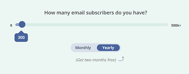
Some SaaS companies who charge based on a number of “something” that you have or need create complicated pricing tables with six or more columns, one for each pricing plan that covers a specific quantity of that “something.”
Kit use their the slider and toggle button to simplify their pricing strategy.
Kit’s pricing strategy works like this: the company has three pricing plans, each of which offers a different set of features with the highest tier having every feature the application offers.
However, besides the free plan, Kit’s pricing is primarily based on the number of email subscribers you have as well as whether you want to pay monthly or annually.
With the slider and toggle button, potential customers are able to adjust the prices that display to suit their individual needs.
List of features in each column
Let’s skip ahead a little and talk about the features section of Kit’s pricing table.
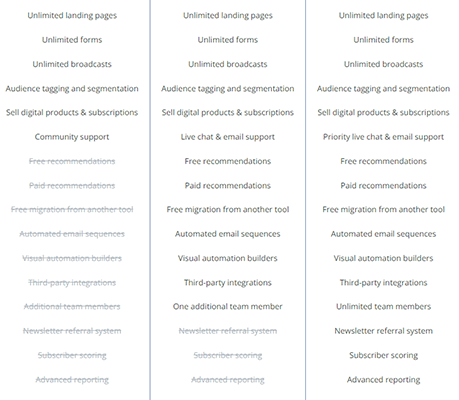
Many SaaS companies only list unique features each of their pricing plans offers. Some have complicated pricing plans in which the features available for each are completely different.
With Kit, the free plan offers basic features, the middle plan offers basic features plus a little more, and the third plan offers basic features, a little more plus a few of additional features.
The email marketing service lists these features in each column but crosses out features that aren’t available for a particular plan.
This is a very simple way to let potential customers know exactly which features they’re missing out on if they choose to subscribe to the first two plans.
Key takeaways
- Use a pricing table in place of previous call to action examples if you have one product that can be broken down into different pricing tiers or multiple products that are similar but different enough to charge different prices for.
- Use two or three columns.
- If you find yourself creating more than five pricing plans, consider simplifying your pricing strategy.
- If you charge based on different quantities of something, use slider and toggle button UI elements similar to Kit’s.
- Provide brief terms and conditions underneath each price. For annual plans, Kit provides the explanation, “$108 billed annually for 300 subscribers.”
- Add a CTA button to each column directly underneath each column’s price.
- List every feature and benefit you offer in each column, but cross out the ones that aren’t available in a particular plan.
- Single one plan out with a “Recommended” or “Most Popular” label.
5. Contact sales button
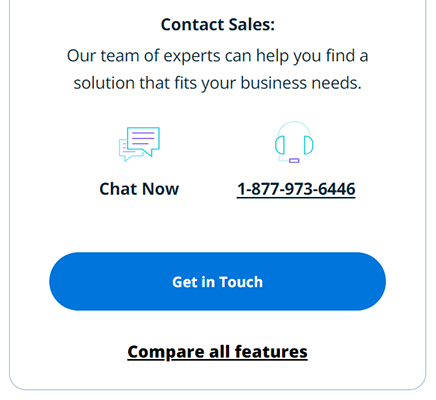
This call to action example builds off of the previous example as it’s a CTA you’ll often find on a pricing page.
There are instances in which you’ll be glad you have a Contact Sales button on your site: when you have larger businesses who are interested in your product or service but require more than what your base plans offer as well as in situations where a customer is about to purchase something from you but is unsure of something.
Both instances benefit from a Contact Sales button by giving your business an opportunity to encourage larger or hesitant customers to convert.
In our example, WP Engine have added a Contact Sales CTA to their pricing page.
However, many businesses also add this type of CTA in a live chat widget.
Why WP Engine’s CTA is so effective
Having to talk to a company directly in order to purchase something can be a bit of a hassle. WP Engine remove some of that hassle by adding simple buttons for live chat and phone support options.
The company’s sales phone number is even clearly listed in case a potential customer would prefer to dial it themselves.
WP Engine even dedicate their tagline to a clear explanation as to when potential customers should resort to contacting sales: “Our team of experts can help you find a solution that fits your business needs.”
There’s even a “compare features” link that toggles a list of every feature the company’s enterprise plan offers.
Key takeaways
- Use a Contact Sales CTA if you offer a product or service larger businesses are interested in. Keep in mind you’ll have to actually hire dedicated sales representatives for this purpose.
- Add this CTA as an additional pricing tier.
- Include different CTA buttons for each sales channel you offer.
- Connect your sales staff to a live chat feature on your website.
6. Learn more/view more button
This example is similar to our first two call to action examples on this list as it uses the same layout. However, this serves a different purpose: it’s meant to drive traffic to a particular landing page.
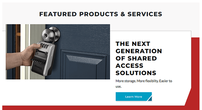
Our example comes from MasterLock, who are using their learn more CTA to drive traffic to their landing page for their “next-generation” lock boxes.
This CTA type is also popular as a way to drive traffic to a features page in which marketers use the text “View Features” on the CTA button.
Why MasterLock’s CTA is so effective
Let’s go over the layout once more as it’s the same as our first two call to action examples:
- Image
- Main heading
- Tagline
- CTA button
MasterLock’s version is just a bit more condensed.
Here’s what they’re doing with each of these sections:
- Image – MasterLock have inserted a picture of one of the lock boxes they’re advertising with this CTA.
- Main heading – MasterLock introduce their product with the phrase, “The Next Generation of Shared Access Solutions.”
- Tagline – The company lists benefits of their lock boxes in their tagline: “More storage. More flexibility. Easier to use.”
- CTA button – Instead of taking you directly to a product page, MasterLock uses the “Learn More” CTA to lead you to their landing page for their lock boxes.
It’s a straightforward call to action layout, but MasterLock do a lot with a little by showcasing their product with an image, introducing it in the CTA’s main heading and providing a brief description of their benefits in their tagline.
Key takeaways
- Advertise your product with a real image of it or a realistic representation of what customers can expect.
- Introduce your product with a simple yet catchy headline.
- Explain your product’s primary benefits with a brief tagline.
- Use a “Learn More” or “View Features/More” CTA button.
Final thoughts
Here are a few “honorable mentions” of CTA types we didn’t cover in this post:
- Two CTAs – A CTA that uses two CTA buttons to promote different products/services or parts of a website within a single CTA.
- Engagement – A CTA that gets visitors to engage with your website. Examples include a quiz or feedback poll.
- Social Sharing – Social sharing buttons can be considered a type of call to action.
Let’s talk about the CTA examples we did cover.
These call to action examples demonstrate how easy a few UI elements or tweaks to your current calls to action can really do a lot to improve conversions.
The most important takeaway from this article should be knowing when to use each call to example type and when to use multiple.
For example, if you use the third CTA type, the one that uses a “Buy Now” button to drive direct sales, but find that the majority of customers do not convert, experiment with using a second CTA, specifically the “Learn More” type.
By leading your target audience to your features page before presenting them with a “Buy Now” CTA, you give them the opportunity to learn more about your product or service before asking them to buy.
Another important aspect of using calls to action effectively is knowing where to use them. They work great on top-level pages, such as your homepage, but you should really build landing pages designed to get potential customers to interact with your CTAs.
Check out our post describing the different sections of high-converting landing pages to learn more.