Landing page optimization is one of the fastest ways to get more leads and sales without spending more on traffic.
When your landing pages convert better, your customer acquisition costs drop, your user experience improves, and more visitors turn into subscribers and paying customers. Same traffic. Better results.
In this guide, I’ll walk you through everything you need to know about landing page optimization, step by step.
You’ll learn what landing page optimization is, how it works, and why it matters. Then I’ll share practical tips and best practices you can apply right away.
After that, I’ll show you how to keep improving your landing pages using A/B testing, so your conversion rates continue to climb over time. I’ll also cover the tools that make the whole process faster and easier.
What are landing pages?
Landing pages are—as the name suggests—the website pages that your prospects ‘land on’ after clicking a link. That link might be a search result, marketing email, paid ad, or anything else.
The goal of a landing page is to get the visitor to complete a specific conversion action. Or in other words, to do the thing you want them to do.
If the goal is to build your mailing list, the conversion action might be for your visitors to submit an email opt-in form.

If the goal is to generate leads, the conversion action might be to get them to schedule a call with your sales team, or submit an inquiry form.
If the goal is to drive sales, the conversion action might be for the visitor to make a purchase, or add a product to their cart. You get the idea.
Here’s the structure of a typical landing page:

Note: You can learn more about each of these components in my article on landing page anatomy.
When a visitor completes the desired action, it counts as a conversion. And we can calculate the landing page’s conversion rate by dividing the total number of conversions by the total number of page visits.
Conversion rate is the most useful metric for determining how ‘good’ a landing page is. The higher the conversion rate, the better.
What is landing page optimization?
Landing page optimization is the process of improving (or ‘optimizing’) the landing page in order to increase its conversion rate, so that more of your clicks result in conversions.
This usually involves changing different landing page elements and tweaking content, then running an A/B test to compare the new variant against the old one and figure out which one performs best.
We’ll talk more about this later when we discuss testing.
But first, let’s look at some landing page optimization best practices.
Landing page optimization: Tips & best practices
There’s no one-size-fits-all ‘best way’ to optimize your landing pages. And that’s because every business is different.
The needs of top-level C-suite executives are going to be very different from a touring musician, for example.
However, there are some general ‘best practices’ that you can follow as a starting point. And from there, it’s all about running A/B tests to figure out what your target audience responds the best to in order to further improve your conversions.
Some high-converting landing pages might fly in the face of best practice and that’s ok. This is just a baseline for you to start from.
With that in mind, here are some general tips and best practices for landing page optimization that should convert well across most verticals.
1. Personalize your landing pages for different traffic sources
As part of your marketing campaign, you might be driving website traffic through different sources.
For example, some of your clicks might come from paid search ads (e.g. Google Adwords), whereas others might come from social media.
And your visitors are likely to behave differently depending on which source they’ve come from. They might be more likely to be further down the funnel if they already follow you on social media, for example.
As such, it’s worth personalizing your landing pages to best meet the needs of each traffic source.
There are a couple of ways to go about this. One option is to set up multiple dedicated landing pages; one for each traffic source.
Another option is to utilize dynamic content to automatically tailor the content on your landing page based on the behavior, preferences, and interests of the user.
There are tools that can help with this.
For example, the Unbounce landing page builder has a built-in Smart Traffic feature that proactively learns about your page and visitor attributes. Then, it automatically routes your visitors to the best landing page for them based on their location, timezone, browser, etc.

We’ll look at other tools that can help with LPO later in this post.
2. Limit available website actions
Landing pages are supposed to do one thing and one thing only: Get the visitor to take the desired conversion action. And they should be laser-focused on that specific goal.
As such, you should limit the actions that users can take on the landing page so that the only thing they can do is the thing you want them to do.
For example, if you want to get them to sign up for your mailing list, the only thing they should be able to do is enter and submit their email address.
All other navigation elements, form fields, buttons, etc. should be removed in order to minimize distractions.
3. Communicate your value proposition in the headline
The headline is arguably the most important part of your landing page.
It’s the first—and often, the only—thing your visitors see when they click the page. 80% of your landing page visitors will see the headline, but only 20% will bother reading further than that.
A good headline will clearly communicate your value proposition. That is, it should say what value you can offer to your customers/users and the reason they should choose your product/service.
Here’s ours:

Your headline should also be short and succinct: No more than 8 words, ideally.
Note: The headline will usually appear at the top of the page, and other elements like the supporting headline, main offer copy, CTA, etc. will appear further down.
4. Place all the important stuff above the fold
The fold is the bottom of the visible part of the screen—the part that the visitor can see before scrolling.
A good chunk of your landing page visitors won’t bother to scroll down the page, so all the important stuff should be placed above the fold.
That includes your headline, main offer copy, form (if applicable), and CTA.
Remember that the fold will be in a different place depending on the device. Therefore, your landing page should utilize responsive design so that all the important content remains above the fold regardless of whether the visitor opens the page on mobile, tablet, or desktop.
5. Keep copy short and concise
Aside from your headline, your landing page should also usually include marketing copy that explains more about the product/service/offers you’re promoting and encourages the visitor to take action.
But nobody likes reading huge walls of text, so make sure you keep your copy short and succinct. A paragraph or two is usually plenty.
You could also consider using bullet point lists or tables to highlight the main features/benefits of your product succinctly without overwhelming the reader.
6. Include social proof
To encourage more visitors to convert, it helps to include social proof somewhere on your landing page.
Social proof is evidence that other people have already found value in what you’re offering.
The most obvious example is customer reviews and testimonials. But social proof can also take the form of expert accreditations, celebrity endorsements, ratings from review aggregators, etc.
To give you an idea of what this might look like in practice, here’s the social proof section of the Blogging Wizard homepage:

7. Use contrasting colors to highlight your CTAs
Aside from your headline, your CTA (call to action) is the other most important part of your landing page.
Your CTA is how you tell your visitors what you want them to do; it’s how you get them to convert.
So naturally, it needs to stand out. And the best way to make your CTA stand out is to use contrasting colors.
Contrasting colors are those that are opposite each other on the color wheel, like red and green, or blue and orange.
If your landing page uses a green color theme, making your CTA button red will give it maximum contrast so that it jumps off the page and catches the visitor’s eye. Likewise, if your landing page uses a red color theme, it’s better to make your CTA button green.
Look at how VWO have used color to make their CTA pop on their landing page:

There are two CTA buttons here, but the ‘Request Demo’ button is bright pink in contrast to the white background, while the ‘Try VWO for free’ button is white, making it blend in.
Which one do you think VWO wants you to click?
8. Utilize visuals
As the saying goes, a picture speaks a thousand words.
Instead of relying on text alone in your landing pages (yawn, boring), try to incorporate visual elements like images, videos, and animations.
This can help to capture the visitor’s attention, elicit an emotional response, communicate more information about your product/service, and ultimately, boost your conversion rate.
See our complete guide to landing page visuals that convert to learn more about how to use visuals effectively.
9. Keep form fields to a minimum
If you’re including a lead capture or email opt-in form on your landing page, try to keep the required form fields to a minimum.
People are lazy. The more they have to do in order to complete a conversion action, the less likely they are to bother.
So if you make it so that customers have to enter their name, address, date of birth, interests, and a bunch of other stuff just to sign up for your mailing list, they’re probably going to just close the page.
It’s a much better idea to just ask for their email address first. And then if you must ask for more information, make those extra form fields optional.
You might even want to set up a multi-step form so that you can get their email address straight away in the first step and only ask for the other details later:

That way, if they don’t complete the other steps, you’ll at least have already captured their email.
10. Improve your page loading speed
The speed that your landing pages load can have a big impact on your conversion rates.
In fact, statistics show that as little as a 2-second delay in load time increases the bounce rate by 103%.
It goes without saying, then, that you should try to make sure your landing pages load as fast as possible.
An easy way to do this is to use a website optimization tool like NitroPack.
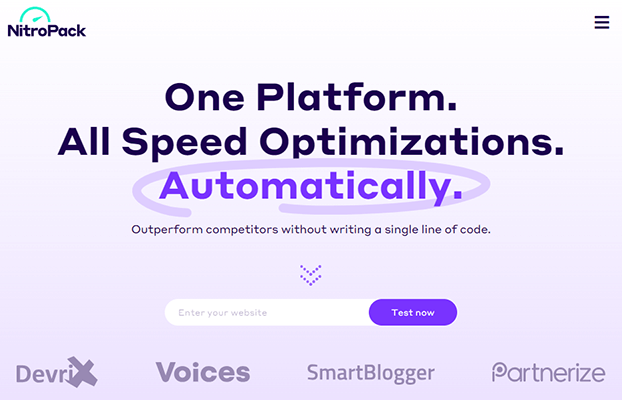
In a couple of clicks, NitroPack can roll out automatic speed enhancements across your website. It’ll optimize your images, minify code, deploy a CDN, and more, which should boost loading speeds.
Related: NitroPack Review (w/ Test Data): Speed Up Your Website With One Tool
There are also other ways to increase your page loading speeds. For example, you could reduce the number of images on the web page, switch to a faster hosting provider, etc.
Aside from helping reduce bounce rate and increase conversions, focusing on landing page SEO is beneficial because improving your landing page speed means your landing page will rank higher within search engines such as Google, compared to those that run slower.
In addition this will improve your landing page conversion rate, because when you optimize landing pages, your visitors are more likely to take action on your site.
Landing page optimization: Testing & analyzing
You can follow the best practices above to guide you when you initially build your landing page. But landing page optimization is an ongoing process—it doesn’t end there.
It’s important to continually analyze each page’s performance to see how visitors are responding to it and to run A/B tests to try to further improve its ability to convert visitors to leads/customers.
For example, you can look at analytics to see what percentage of your visitors are converting, and where those that aren’t are dropping off, in order to identify any bottlenecks.
Plus, you can use UX research tools to record visit sessions and get a first-hand view of exactly how users interact with the page. And you can look at heatmaps to see how visitors move their cursor around the page and where they’re focusing their attention.
Then, you can apply the insights you gather from all of the above to your conversion rate optimization strategy.
And this is where A/B testing comes in.
Let’s imagine that you notice that your CTA button isn’t getting a lot of clicks. And with the help of heat mapping software, you also notice that your visitors are devoting most of their attention to the left half of the page, but your CTA is on the right.
To fix the problem, you could set up an A/B test.
In the test, you’ll create two variations of the landing page: one with the CTA on the left side of the screen (variant A), and one with the CTA on the right side (variant B).
The A/B testing tool you use can then route some of your traffic (e.g. 50%) to variant A, and the rest to variant B. It’ll gather data to see how many of the visitors to each page convert, and then let you know which one has the best conversion rate. You’ll use the winning variant going forward.
You can rinse and repeat this over and over again to keep testing new changes and refining your design until you have the perfect landing page.
In other tests, you might change things like the headline, page copy, colors, navigation menus, etc. The more A/B tests you run, the more optimized your page will be.
Landing page optimization: Essential tools
In order to start optimizing landing pages, you’ll need some landing page optimization tools. Here’s what we’d suggest.
Landing page builders
A landing page builder provides the software you need to design your landing pages.
They typically come with professionally-designed templates for different types of targeted landing pages (e.g. squeeze pages, lead capture pages, etc.) as well as a drag-and-drop editor that you can use to customize them.
Some also come with advanced features like built-in A/B testing, personalization tools, analytics, etc.
Here are my top recommendations right now:
- Swipe Pages – Best for most users. Offers the best balance of features and affordability.
- Instapage – Best for teams. Includes heatmaps & A/B testing, large library of templates, and advanced collaboration features.
- Woorise – Best for interactive campaigns. For example, giveaway and quiz-based landing pages.
- OptimizePress – Best for WordPress users. There’s a bit more of a learning curve involved here but you can get very granular with your landing pages. And it’s quite affordable for what’s on offer. If you’re a blogger that uses WordPress, I’d go for OptimizePress rather than the other options.
You can find more options in our roundup of the best landing page builders and in our comparison of the top WordPress landing page plugins.
Testing and optimization tools
Aside from your landing page builder, you’ll also probably want to invest in testing and optimization software.
For behavioral analytics, Mouseflow is an industry leader. They’re focused mostly on heatmaps.

It offers session replays (so you can rewatch how different visitor segments interact with your landing page), heatmaps (so you can analyze clicks, scrolls, hovers, etc.), conversion funnels (so you can see where customers drop off and covert), user feedback, and more.
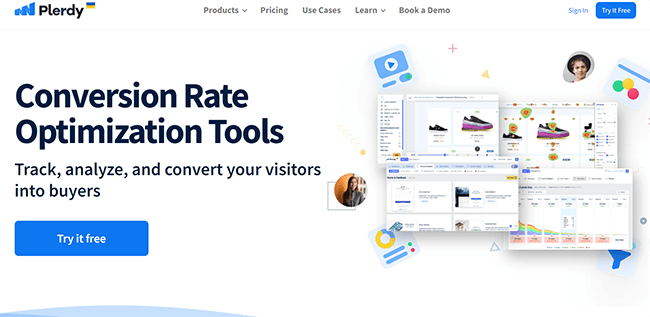
If you want a platform that goes beyond heatmaps to cover things like A/B testing, session replays, funnel analytics, and more – Plerdy is the answer. The best part? They offer a free plan and paid plans are surprisingly affordable.
Final thoughts
That wraps up this guide to landing page optimization.
You now know what landing page optimization is, why it matters, and how to do it the right way. You’ve got the frameworks, the tactics, and the tools to start improving your conversion rates.
From here, it’s all about execution. Pick one page, make one change, test it, and let the data tell you what works. Do that consistently and the results add up fast.
You can start by creating your landing pages using a tool like Swipe Pages or OptimizePress while following the best practices we covered above. This is your starting point.
Everything after that requires testing. And for that, you can use an experimentation tool like Plerdy to optimize further.
Disclosure: Our content is reader-supported. If you click on certain links we may make a commission.