The Anatomy Of A High-Converting Landing Page

Want to create landing pages that convert but not sure where to start? Or which elements to include on your pages? We’ve got you covered.
In this post, we’re breaking down the anatomy of a high-converting landing page so you can see the exact elements your page needs to deliver results.
The anatomy of a high-converting landing page at a glance
Let’s start by familiarizing ourselves with the general anatomy of a high-converting landing page.
Take a look at the image below:
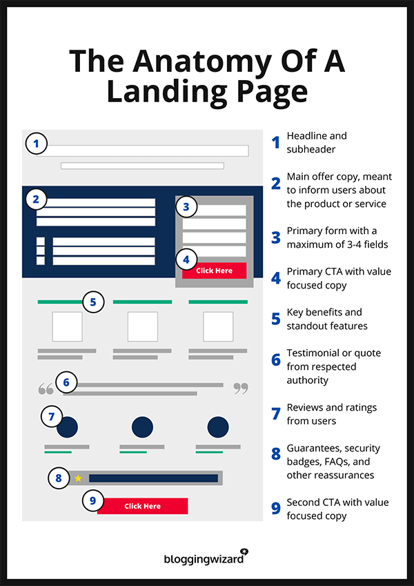
As you can see, there are 9 key elements that make up the page:
- Header and subheader
- Main offer copy
- Primary form
- Primary CTA
- Key benefits/features list
- Social proof – testimonials
- Social proof – reviews
- Reassurances – guarantees, FAQs, etc.
- Secondary CTA
If you want to maximize conversions, you’ll need to get each of these elements right. With that in mind, let’s zoom in and take a closer look at how to nail each of them, step-by-step.
1. Write a killer headline
Your headline is the first thing your customers will see when they land on the page, so it needs to be good.
In fact, the majority of the people that see your landing page will only ever see your headline. Only 20% will bother to read the rest of the copy on your page.
If you want to make them read on, you’ve got to grab their attention right from the get-go.
And the way to do that is to clearly state your value proposition in the headline.
Your value proposition is a statement that tells your customers why they should choose your product/service. You’ll want to put that front and center.
Just like this example from Outskirts Press:
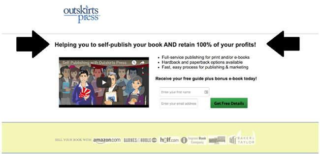
Try to communicate exactly what makes your offer so special so that your visitors immediately understand why they’d want to get their hands on it, but keep it short and sweet – the best headlines are clear and succinct. I’d recommend keeping it under 8 words if possible.
If yours is longer than that, take a knife to it and cut away any jargon and brand-focused copy. Make sure the focus is on the offer and nothing else.
And if you need some inspiration, check out our post on value proposition examples.
Bonus tip: Create different versions of your landing page and tailor each headline to the traffic source. You want your headlines to be laser-targeted to the people that are reading them.
2. Throw in a supporting headline
Your headline is there to grab your visitor’s attention, but 8 words isn’t a lot to work with. It’s rarely going to be enough to give your readers all the info they need.
Your subheader is there to support your main headline by allowing you to throw in an extra touch of extra information. It can offer additional value, or convey a second relevant and persuasive message about how great your offer is.
It can also ‘extend’ the message of your main headline, as Taster’s Club has demonstrated here:
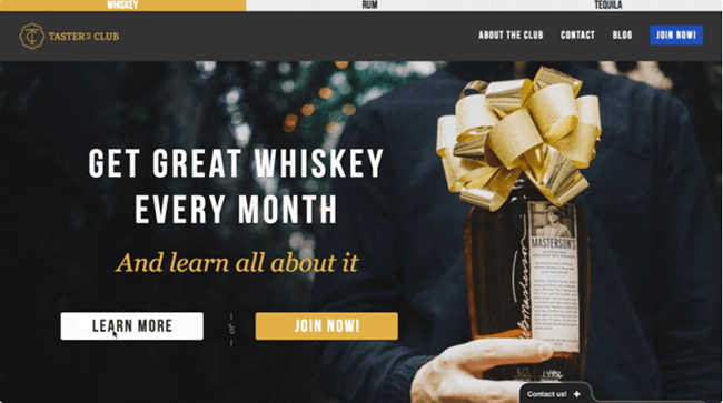
As you can see, their headline communicates exactly why visitors should join their subscription service (to get great whiskey), while the subheading extends the value proposition to highlight the fact that they also provide info about the whiskey that can help customers to learn more about the products they try.
Quick note: Try not to get carried away here. The goal isn’t to give your visitor all the details they need to be ready to convert (we’re going to deliver that to them bit-by-bit across the page). As with the headline, you’ll want to keep your subheader short.
3. Craft your main offer copy
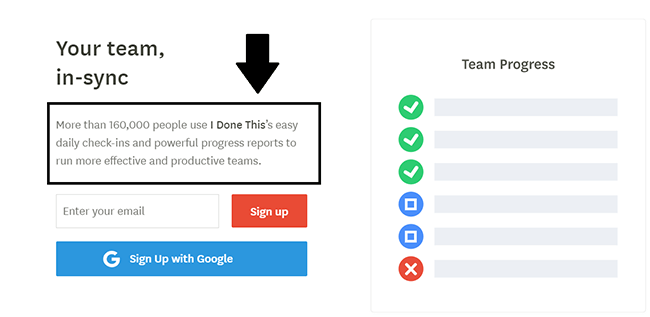
Your main offer copy comes next. This is where you inform visitors about your product or service. Ask yourself what your reader needs to know about your offer and deliver that information to them in the most persuasive, concise way you can.
We’re going to highlight the standout features/benefits separately (see step 5) to really drive the message home, so this section is more about giving a broad overview of the critical information your customers need – but it still needs to be persuasive.
Here are some best practices to help you to craft copy that converts:
- Utilize “power words” to underscore the product’s capabilities. These are high-impact, visually-rich words, like “beautiful”, “stunning”, and “genius”.
- Follow the information hierarchy. Structure your copy in such a way as to answer the “what” questions first, then the “how”, “why”, “who”, and the “what next” (in that order).
- Keep it punchy. Use short sentences, bullet points, line breaks, and generous whitespace to aid with legibility.
- Label your audience. Refer to your customers by the groups/qualities they want to identify as (think “expert marketers” or “hardworking salespeople”)
- Utilize scarcity marketing. Add time- and quantity-based scarcity into your copy by highlighting limited stock or time-limited deals.
Bonus tip: You might want to scrap your main offer copy completely and replace it with a video that provides the same information. Walls of text are hard for your customers to read. Studies show that your brain processes video 60,000 faster than text. Plus, a video also gives a nice visual focus to your landing pages and functions as your hero image.
The catch? Slower load times. Videos make your landing pages load less quickly, which can hurt your conversions.
4. Create your primary form
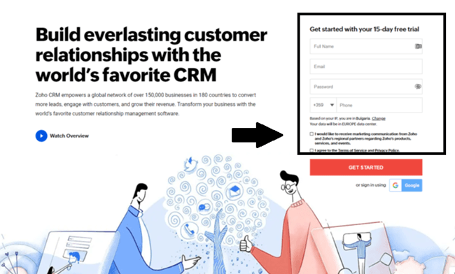
Your lead capture form comes next. This should be above the fold and take center stage on the page to really draw your visitors’ eyes.
You’ll also want to follow best-practices for high-converting forms, by:
- Gradually increasing your ‘ask’. Start by asking for low-value data (i.e. ‘first name’) and then ask for more valuable data next (i.e. ‘email address’)
- Removing unnecessary form fields. The fewer form fields your visitors have to fill in, the more likely they are to convert.
- Simplifying your forms for mobile users. Make sure your form is touch-friendly for mobile users with larger buttons and easy date-pickers.
5. Present your primary CTA
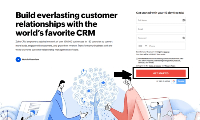
Your CTA is everything. Every landing page should be built and designed around one single conversion goal (i.e. download an ebook, buy a product, join your mailing list). Your CTA is there to motivate your customers to act on that conversion goal.
Assuming your conversion goal is to capture leads, your primary CTA is going to be next to your primary form.
- Use value-focused CTA copy. Focus on the value customers can derive from the offer.
- Use creative terms on your CTA button. Rather than the generic ‘buy now’, try to get creative and use terms like “Get my FREE trial”, or “Yes, I want [key benefit]”
- Make it stand out. Use directional cues like arrows, borders, and icons to guide your customers’ eyes towards your CTA
- Use high-contrast colors. This will help your CTA to stand out from the rest of the page.
6. Highlight your standout features & benefits
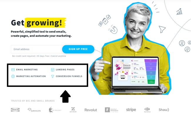
High-converting landing pages draw attention to the features & benefits that are most likely to make your visitors want to take action.
Put yourself in the shoes of your target buyer. What is it they’d most want to see in your offer? These are the features you’ll want to highlight.
The benefits are even more important. People pay for solutions, not products, and your benefits are there to show your customers exactly what solutions you’re offering. Figure out what your customers’ pain points are and outline how your problem addresses those pain points in your benefits
For example, if one of your buyer’s pain points is the length of time it takes to do something. One of the benefits you could highlight might be “saves 3 hours, on average”… you get the idea.
Your features and benefits should be listed in bullet points or standalone visual elements so that your visitors see them immediately and can read them quickly.
7. Include social proof
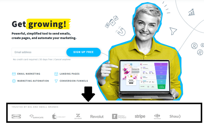
Social proof is incredibly important. It’s there to give your customers real evidence from other users/buyers that your product/service is worth being excited about – and it’s an essential feature of all high-converting landing pages.
Data suggests that landing pages that include social proof have average conversion rates of 12.50%, compared to 11.40% amongst those that don’t.
Make sure you include testimonials, reviews, customer quotes, social signals, awards, or other visual forms of social proof on the page where your customer can see it. If you do choose to feature customer reviews, choose those that are the most personal, realistic, and specific (and of course, positive).
8. Offer reassurances
The more comfortable your website visitors are, and the more they trust you, the more likely they are to convert.
It’s normal for customers to have concerns before they make a purchase. They might be worried about whether your website payment is secure, whether your offer is legit, or whether your products will be suitable for them.
Reassurances help to address these concerns so that they’re ready to convert.
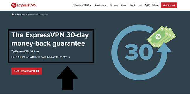
If you’re offering a 30-day money-back guarantee or a free trial period, make sure this is clear on your landing page. You might also want to display any relevant security badges or provide FAQs that address the most common customer concerns.
All of the above will help you to reassure your customers and eke out the maximum possible conversions.
9. Add your secondary CTA
For short-form landing pages, you may want to skip this step entirely.
But in general, most landing pages will benefit from a secondary CTA towards the bottom of the page.
This gives your customers something to click straight away without having to scroll back up to the top of the page.
You should follow the same approach that we discussed for your primary CTA. And be sure to use the exact same color. You may want to change the copy slightly, but the color needs to remain the same for consistency.
Just don’t go crazy and stick to 1 or 2 CTAs at the most. Studies suggest that pages with 5 or more CTA links have significantly lower conversion rates.
Final thoughts
There you have it – the complete anatomy of a high-converting landing page. Follow the guidelines above to craft your own landing page and you should see good results.
Just remember that these are just best practices; every campaign and product is different.
And as is the case with best practices, they should be used as a starting point. Once your initial landing page is ready, you can A/B test to improve conversions further.
And if you need more help to build & optimize your landing pages, check out these posts:
