24 Landing Page Examples To Inspire You And Boost Conversions
Let’s get one thing straight: a landing page is more than just another page on your website; it’s a little prompt to ensure your visitors do whatever it is you want them to do:
- Buy and download an eBook
- Sign up for a service
- Download a freebie PDF
- Get discounts and hot gossip through an email newsletter
- Purchase a product
- Subscribe to a membership
It’s not just a home page (although it can be), or another page on your blog or website; it’s a guiding hand.
Think of a landing page as the annoying salesperson that comes up to you when you’re just browsing in a mobile phone shop, but without all the annoying bits — it’ll answer your questions, soothe your concerns, direct you to where you need to be, and encourage you to do whatever you’re thinking of doing … with confidence.
That’s the aim of the game, anyway.
It doesn’t matter what you’re giving away, selling, or providing, if your landing page isn’t quite right, people aren’t going to want to sign up for it.
They’ll click on … and then click off — a completely wasted opportunity. That is, of course, unless you take some tips from the pros — those webmasters doing landing pages the RIGHT way.
But what is the right way?
What is right for one website won’t be right for another. A landing page for YOUR website or blog needs to be specifically-created and designed with YOUR readers in mind.
If you don’t understand your readers — your target audience — you’re going to have a hard time figuring out the right kind of landing page design.
But there are a few AMAZING examples out there that you can learn from, take inspiration from, and then use to build a landing page that converts amazingly for you, no matter what you’re offering.
Let’s take a look at some of these examples…
Email capture pages
Everyone is obsessed with email lists right now, and it’s for good reason — they’re a foot in the door with a potential customer or person that you wouldn’t otherwise have.
In a physical store, when a customer walks in and then walks out again, without purchasing anything, you have no way of getting in touch with them again.
When you’re in an online setting, however, you can grab a little piece of information from them that will help you to connect with them again in the future.
The digital era has arrived! So, let’s take a look at some really awesome email capture pages.
1 – Funnel Overload 2-step opt-in
Having a lot of ‘stuff’ on one page can seem really intimidating and overwhelming to a visitor, and that’s exactly the opposite effect you want to have. This is even more so the case when you want them to part with their hard-earned cash or hand over those precious contact details.
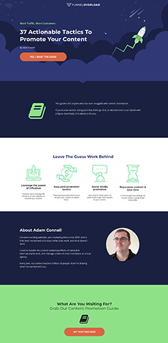
One way to eliminate that problem is to use something called two-step opt-ins — literally splitting the problem in two. Funnel Overload does exactly that with their 37 Actionable Tactics To Promote Your Content, in two different ways.
The first page [landing page] tells you what you need to know about your download — who the guide is for, the benefits you’ll reap from it, and a bit about the person who created it. The latter will appeal to an audience on a slightly more personal level, putting a face to the name.
The second part of the process is where the visitor will enter their details, and that’s been done in a two-step process too.
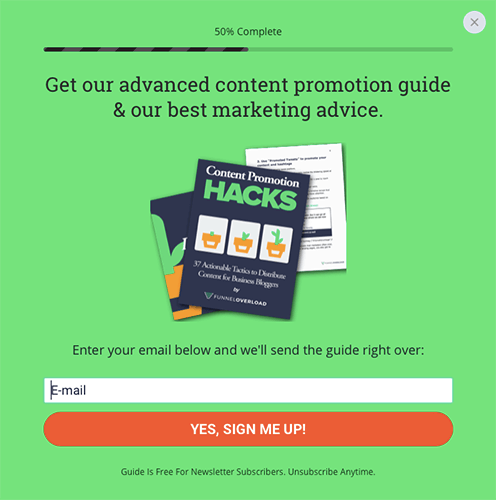
The visitor first enters their email address and submits it, before then being sent an email with a link asking them to confirm. If they go through all of that, they *definitely* want to be on the email list, which means they’re definitely interested in what’s being offered.
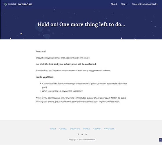
It takes a bit more work to get to the point where a visitor will be comfortable to sign up, but when they do, they are deliberately there, no two ways about it. You’re more likely to get sales/leads/etc. from the sign-ups.
Note: Funnel Overload has rebranded to Startup Bonsai.
2 – Mettle email capture page
Applying for a brand new business credit card starts with a simple email address when you sign up with Mettle, and the landing page (known as a squeeze page) is specifically designed to capture those details and get the ball rolling.
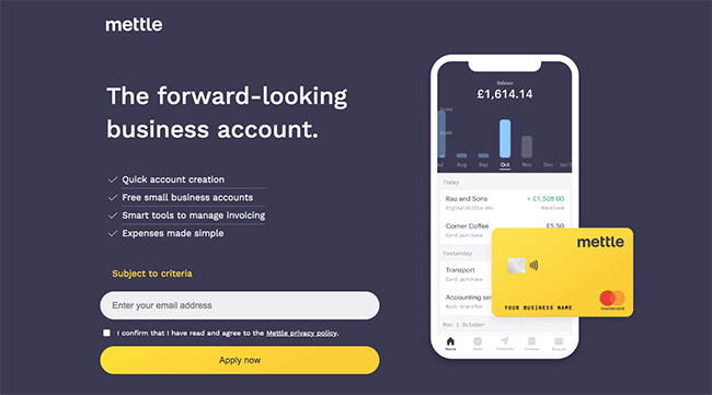
With an email address (and check-boxed T&Cs), that company can still contact a potential customer with future offers, deals, propositions for business credit cards, etc. even if they don’t complete the application process.
Without an email address, however, that company can’t contact the customer (or try to sell them something) at all.
Entering an email address, confirming the T&Cs, and hitting the ‘Apply now’ button is the only process a visitor would be able to take on that page, aside from leaving it.
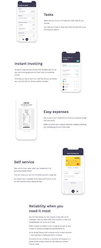
If they were to scroll down the page, they’ll read various ways that Mettle can greatly benefit a business — “Easy expenses”, “Instant invoicing”, “Reliability when you need it most”, etc., making great plus points — all in bold, clear, easy-to-read text, with words that are going to attract the attention of a business owner the most.
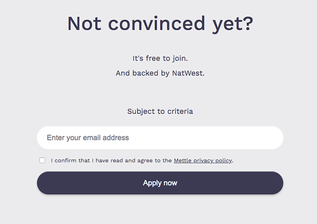
The bottom of the page is home to a second email-entry prompt — entering an email and hitting the ‘Apply now’ button is STILL the only thing a visitor can do, except now they’ve read through the page and feel more confident about their decision.
3 – Secret Escapes email capture page
Secret Escapes uses a pop-up to capture a visitor’s email address, which is then used to create a free membership that gives the customer access to some really awesome deals on holidays and luxury hotels.
Don’t we all need a holiday?!
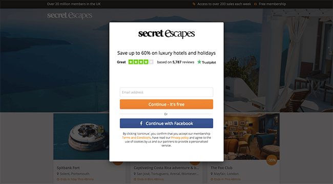
There are a few things that you should pay attention to on this email capture page. The Trustpilot score is a great way to show potential customers and clients that your website is a trustworthy one, and the 4/5 star score has been put together from almost 6,000 reviews!
If almost 6,000 people are saying the site is a good one to use, it must be.
The language used on the call-to-action button has also been thought about carefully. Using something like “Continue – It’s free” tells the visitor that they have nothing to lose by subscribing or signing up, and it’s more friendly than just “Submit”.
Click-through landing pages
These pages aren’t actually designed to capture information at all, but instead have been built to reinforce a purchasing or subscription action from a visitor. They’re the “just do it” of landing pages — the middle-man giving visitors that one final push before they buy, sign up, etc.
Let’s take a few of those and scrutinise them …
4 – Bark click-through landing page
Bark is a company you might call upon if you’re looking for wedding flowers in the London, UK area, and its click-through landing page keeps things short n’ simple.
Location is everything when you’re buying a physical object that can’t easily be shipped, so a postcode is the first step to getting the process started.
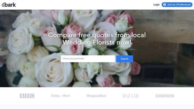
There’s a feature on the Bark landing page that I think you should pay special attention to: the ‘featured on’ section that runs across the bottom.
This is put in place to make a visitor feel reassured that they are making the right decision in putting their email into that box and starting off the purchasing or ordering process with Bark.
If the flowers are good enough for the likes of The Guardian, Cosmopolitan, BBC, Daily Mail, and Bazaar, they’re good enough for the rest of us!

If you have an “as featured in/on” to boast about, that’s definitely the kind of thing that should be added to a landing page. Nothing says ‘you can trust me’ more than a celebrity/well-known endorsement!
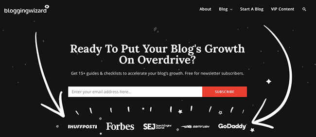
This is a tip used on this very website too — on the Blogging Wizard home page. It’s a trick known as “social proof” – and you’ll find a guide to it right here > How To Leverage Social Proof On Your Blog: A Beginner’s Guide.
5 – Netflix click-through page
Do you know how many people end up paying for subscription services or memberships they don’t use just because they never get around to cancelling them? I don’t know the answer, but I can tell you that it’s at least one.
Me ??♀️
I pay for a gym membership I never use (I need Ross and Chandler on my side), a Spotify subscription on an app I don’t think I’ve even opened since I first signed up (Apple Music for the win), and even a £7.99-a-month membership for an app that identifies flower species by photo … that I used once, two and a half years ago, to win an argument with my sister over crocus versus iris.

It’s also why I ended up with a Netflix subscription. I signed up, never used it, and then six or seven months later, a friend asked me if I have a Netflix subscription they can use, reminding me I had it. I’ve used the app daily ever since!
There’s one of your biggest (but not only) benefits of having a free trial to lure in new customers on your click-through page.
The landing page for Netflix is no-nonsense. You can scroll down the page to find out the specific details, but you’re encouraged to learn more with that big, bright-red “TRY 30 DAYS FREE” button. And then there’s the encouragement and reassurance you need as a consumer — “cancel at any time.”
Simple, yet effective.
No muss, no fuss.
6 – Just Eat click-through landing page
Feeling hungry? Search for “food near me” and you might just come across an ad for Just Eat — a food delivery service.
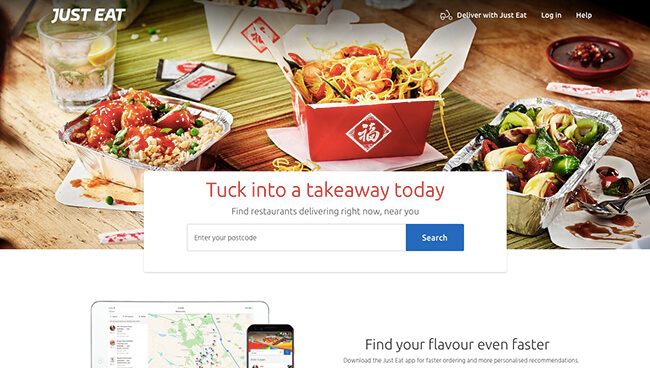
This click-through landing page makes things as easy as they should be for a hungry browser: simply insert your postcode, click on the search button, and then find all the delicious food places close to you that you can pick from … along with actual customer reviews to stop you from making any poor food choices.
And just in case you weren’t already hungry enough, there’s a nice, big photo of what you might have for dinner emblazoned across the page.
You can blame that image for the fact you planned to order dinner-for-two, but actually ordered enough to feed almost your entire street.
Oh no, wait, that’s me.
7 – WWF click-through landing page
The landing page to adopt an animal with World Wide Fund for Nature (known previously as World Wildlife Fund) appeals to visitors in exactly the way we discussed in Landing Page Visuals That Convert: Your Complete Guide — using the knowledge that people are “hardwired to notice faces”, and then using those faces to make visitors feel a certain emotion.
This is usually one that encourages a sign up, purchase, or other action.
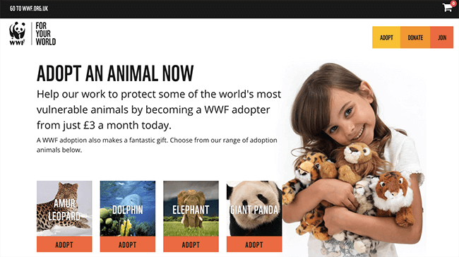
The child looks delighted to have an armful of cute n’ cuddly creatures, causing the visitor to feel delight or joy in turn.
We should next look at the language used — and how it is used.
“ADOPT AN ANIMAL NOW”
Right now. The visitor should do it right this very second. Why?
“most vulnerable animals”
These words are some of the biggest and boldest words on the page, specifically designed to invoke a reaction. The right-now actions of the visitor will help to “protect some of the world’s most vulnerable animals”.
“from just £3 a month today”
That’s it. It’s *JUST* £3 a month. That’s the cost of a cup of coffee from your local favourite barista bar.
*JUST* one cup of coffee a month … starting “today”.
And finally, if you are in any doubt as to whether or not this landing page style will work, I am proof that it works. I am the proud owner of my very own WWF stuffed animal, because *I* was lured in by the emotional appeal of the landing page.

And I’m a marketer … I know the tricks!!
8 – First Union long-form click-through landing page
If you’ve been on the hunt for a mortgage recently, you might’ve come across this ad on Google — First Union. The landing page has both good and bad features, both of which I felt were important to talk about.
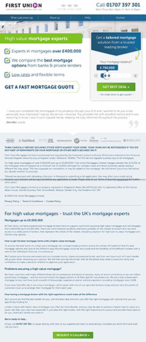
This is technically a longer-form landing page than most, especially click-through/lead-capture pages, but is definitely a landing page example worth looking at.
Let’s start with the good.
The sliding number amount is just dying to be played with. Anything that gets your visitor interacting with the page is a good thing … providing it’s not complicated.
The wording on the button is awesome too. You’re not being asked to “submit” your details, or “get a quote”. Instead, you’re getting your “best deal”, just like you’re living your best life!
There’s a testimonial from a happy customer, reassuring the visitor that other people think the company is a good one, and there’s a long list of ‘working with’ companies — Barclays, Natwest, Halifax, etc., They’re all big names in British banking, which would lead the visitor to feel the website could be trusted.
Finally, there’s another call-to action right at the bottom of the page (if you scroll through all that text). The visitor wouldn’t need to scroll all the way back up the page if they were interested in talking to someone and learning more.
Now, let’s have a couple of moments to just talk about the bad.
Firstly, there is a lot of text on the page. A lot. Too much, some might say.
“Get best deal” would be a better action if it said “Get MY best deal”. Personalising the call-to action is a great way to connect with your visitors and potential customers or clients.
That number on the top right-hand side of the page is a waste of time (some might say) if it’s not a clickable, ring-able number … which it’s not. A visitor would need to copy and paste the number to call it.
9 – Wix click-through landing page
This is a great example of a click-through landing page, and Wix has used a few clever tricks to make sure visitors click and become potential new customers.
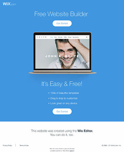
Firstly, there’s that smiling man on the laptop’s screen. That’s designed to make you feel happy and smiley too.
Moving along, the landing page makes it very obvious what you’re “getting started” with — “Free Website Builder” and “It’s Easy & Free!”
Moving along again, Wix uses a clever colour-marketing trick. Blue is a calming, natural, trusting colour, used in marketing to soothe and reassure. Website-building is a complicated business, so using a calming, responsible colour for the landing page is a really neat trick.
10 – Petplan click-through landing page
This is a click-through landing page designed to encourage the reader to sign up and protect their pets, with the “UK’s No.1 pet insurance” company. And the landing page doesn’t just use powerful language like that to get the message across…
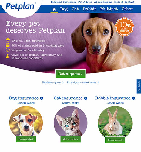
Take a look at the images of the pets on the landing page. What do you see? All the animals are sad — they are designed to hit you on an emotional level. Your pets will be sad if they do not have insurance with Petplan.
This carries on with the bold headline: “Every pet deserves Petplan”.
Whatever Petplan is, just give it to them.
Give the pets the plan so that they can lose the sad faces and have happy ones again!
That’s the aim of the game with an emotional landing page like this one. By the time you’re finished looking through all of those sad pet faces, you’re going to want to guarantee that your pet is never sad again.
The only criticism I will make about this landing page is that the “Get a quote” button is fairly cold and unemotional considering the tone of the rest of the page. Part of me wishes it said “Protect your pet!” or something slightly more caring, warm, and emotional.
11 – Pizza Hut click-through landing page
You know when you walk into a restaurant and that waiter looks at your group, counts how many of you there are, and then says: “table for two, madam?”, like there’s a chance you might pull a third person out of your handbag in a Mary Poppins kinda way?
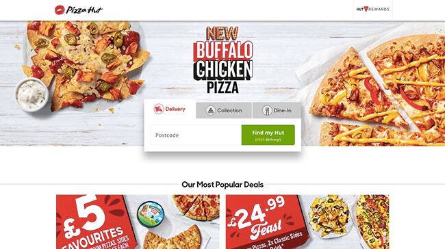
That’s exactly what the Pizza Hut click-through landing page is, but with your postcode instead of people-counting.
Sticking with the same theme, don’t you just love the way you get a whiff of delicious pizza as soon as you walk in through the door of the restaurant? That’s what Pizza Hut tries to recreate with the images of piquant pizza and nom-tastic nachos. They look so good that you can almost smell and taste them. Almost.
A landing page should show off the very best of whatever wares the website offers — or a sneak peek of them. Just enough to lure people in, desperate to get a closer look… or taste.
I’m off to order a Mighty Meaty, be right back!
12 – Yopa click-through landing page
The Yopa click-through landing page might be one you’ll come across if you’re looking to buy, sell, rent, or rent out your home. The calming blue colour of the landing page (and site) has been designed to bring a calming and peaceful vibe to the experience, much in the same way that the Wix website used blue colours to help making the process seem less complicated and confusing.
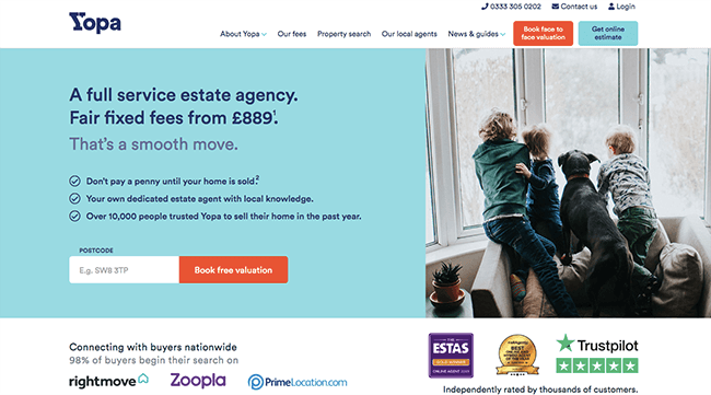
The image is also clever — bringing a sense of family and anticipation. They’re waiting for something. When you look at the image, you’re meant to imagine your own happy family in that new home.
Although there are many plus points here, the one that I want to bring to your attention the most is how many times the call-to-action features on the [long-form] page — and how many different language variations are used.
- “Book free evaluation” can be seen three times.
- “Enter postcode” is there once.
- “Get an instant online evaluation” is also there once, as is –
- “Book a face to face evaluation”, and –
- “Get online estimate”.
Different ways to say the same thing are used to appeal to different and multiple people, and adding the call-to-action on the page multiple times gives the visitor multiple ways to do exactly what you want them to do, no scrolling up and down necessary.
It also gives you the chance to work out which ones work … and which ones don’t.
Lead capture pages
Lead capture pages are usually the ones that load once you’re done with the click-through page, although they can be a landing page all of their own rights.
13 – Yopa lead capture page
If we take our previous click-through page – Yopa – and then actually click-through, we’re met with the following lead capture pages. It’s designed to capture our details (more than just an email address), making us a “lead” — a potential future customer or client.
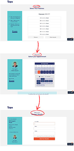
Capturing information can be a bit of a lengthy process, so by splitting it up into four easy-to-manage chunks, Yopa is likely to hold the attention of visitors for a bit longer than having all of the fields on one page alone.
Using “Page 2 of 4” etc.at the top enables visitors to see how far they’ve come, and how much of the form is left to fill out.
14 – Just Eat Driver lead capture page
I’ve mentioned the Just Eat website already, but that was from a customer perspective. This time around, let’s take a look from a driver perspective.
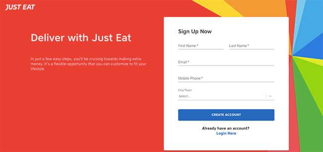
This is what marketers call a “lead capture” page — more than a squeeze page, because you’re squeezing more than just an email address and basic details. You’re also getting both first and last name, mobile phone number, the city/town, etc. These are all important details when you’re applying to be a driver for Just Eat, and the landing page gets that part of the process out the way nice and early.
Further options are available if you scroll further down the page, but the important stuff is right in the forefront as the page loads. That should be the case with all landing pages.
The thing that you actually want the reader to do should be right there, without any scrolling necessary.
15 – Tails.com lead capture page
I don’t have a dog, so I’m not sure why this particular advert popped up on my Facebook feed, but it is an example of a landing page / lead capture page / paid advertising landing page / product page, all in one. (And I do love dogs!)
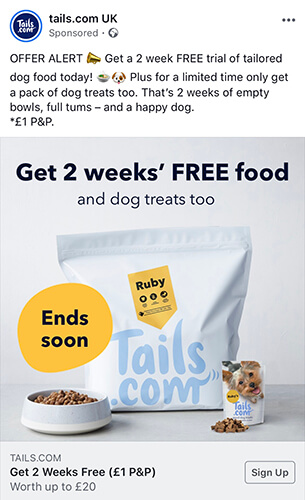
When you’re paying to advertise your wares or services, you want every look and every click to get the best results. That’s why many companies opt for a specific landing page, rather than a regular home page, although the Tails.com page is actually both of those.
The customer is first lured in by the appeal of a freebie — 2 weeks’ FREE food for their beloved pooch. The first image you see when you click on the Sign Up button on the ad is a very happy dog, and one that is licking his or her lips in glee. That’s how happy YOUR dog could be, if you purchase the products.
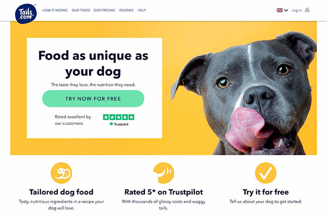
Scroll down the page and you see all the things that you SHOULD see on a great landing page —
A call-to-action that clearly states you’re getting a free trial, in a bold and eye-catching colour.
A Trustpilot rating that shows their products/services are 5-star or “excellent”.
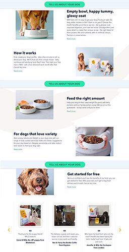
Wording that appeals to a loving dog owner, including “a recipe your dog will love” — focusing on YOU and YOUR dog.
And all of that is matched with another call-to-action that stays at the top of the page as you’re scrolling, asking you to tell them about YOUR dog – friendly, personal language that plays on the idea on all dog owners love to talk about their pets.
And finally, of course, the important part — boasting about where the website has been featured.

Splash pages
A splash page is another type of landing page that can work really work, serving as a middle-man (of sorts) between the visitor and whatever they’re looking for.
A splash page isn’t necessarily going to ask you for any of your details, but is usually instead used to alert you to something, point you in the right direction of something, or act as a middleman between you and a few different things.
16 – Aspire age verification splash page
Aspire is a globally-known vape manufacturer, and being vape-orientated, the website and all products are 18/21+ restricted (depending on where you are in the world).
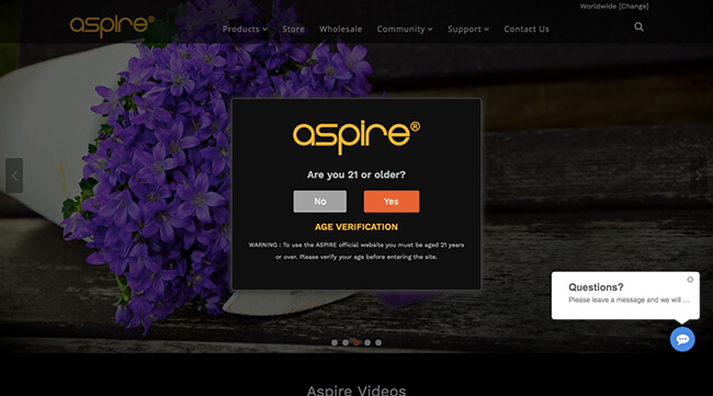
The splash page is used to make sure the visitor is of legal age, not just to prevent visitor dissatisfaction further down the line, but also to cover the online store’s back. It’s a legality thing.
Most vape websites have a similar splash page — the checking-age one — but that’s not the only reason why that splash page might come up.
17 – Jac Vapour age verification & cookie consent page
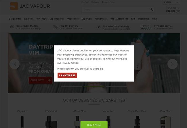
Taking a peek at the Jac Vapour (another vape manufacturer) website, you can see that a similar splash page has been used, but instead of just having an age verification notice, the website also uses that space to tell the visitor about the cookies. (And no, we’re not talking of the good, choc-chip kind.)
It’s best to keep these pages short, sweet, and to the point. You want visitors to verify their age/cookie consent and then continue to shop as quickly as possible.
18 – H&M Country-Select splash page
The H&M website uses a splash page to make sure you’re taken to the right website, in the right language and part of the world. There’s little point in shopping on the South African H&M website (in that currency) when you’re a Brit, paying in pounds… which I am.
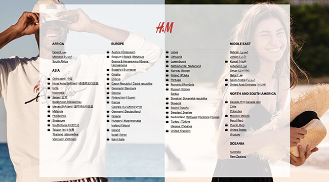
This splash page/landing page is the equivalent of walking into a unisex clothing shop and asking for directions to the mens section, so the simpler you keep it, the better.
19 – Little Mix Instagram landing/splash page
An Instagram landing page is a good example of a splash page, especially when you look at this Little Mix example. By clicking on the link in their bio, you are taken to a page that directs you wherever you need to go.
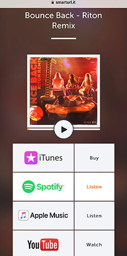
If you want to buy the song on iTunes, there’s a button for that. There’s also a button for you to listen to the song on Spotify, and Apple Music, and finally, an option to watch on YouTube.
There are no other actions that can be taken from that page. It’s not designed to capture any of your details, or even necessarily to persuade you to buy anything; it’s a signpost to ensure you get to exactly where you want to go.
20 – Blogging Wizard Instagram landing page
This is another example of a splash page on Instagram, taken from the account of this very blog. As you can see, there is an option to sign up to the email newsletter, but that’s not the only option you have. You can also head to the blog and check out the latest content, or be taken directly to the most helpful pieces of content.
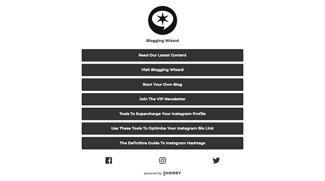
The whole point of an Instagram landing page is to take your visitors from Instagram to a page on your blog/site that will be useful. When building the page, you should give visitors options … but not too many options that they feel completely overwhelmed.
Product pages
When you have a brand new product just begging to be bought, what’s the point in throwing the middle man in there with a click-through page? You don’t need a middle man; you need a page that’s going to sell all the best points of that product, convincing your clients or customers that you have exactly what they want — and for the best price!
Let’s take a peek at some amazing product landing pages that do just that…
21 – Apple iPad product landing page
Let’s just pretend you did a little Google search for “iPad”, because you’re thinking about buying yourself a new one. It’s good to treat yourself!
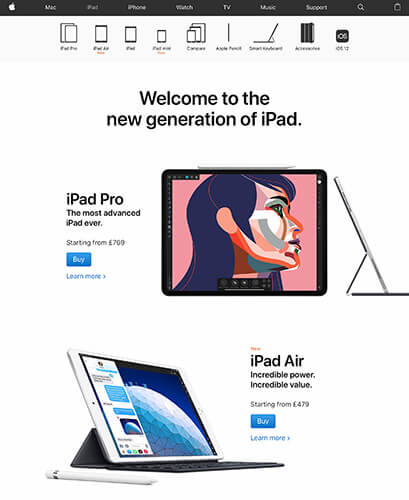
There are actually lots of actions that you can take from this page, but most of them cleverly fade into the background. The two menus at the top are almost not there at all. They don’t grab your attention.
The actual, purchasing call-to-actions, though, are the opposite.
They don’t fade into the background. They are bright, blue, and obvious. The entire layout of the page is designed to make you forget there are other pages on the site at all; the “Buy” button is the only one you really need to know about.
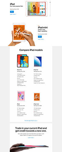
All of the call-to-actions on the long page stick with the same theme — blue, bright, standing out from the rest of the text, accompanied with a little blue arrow >.
22 – Xbox One product landing page
It’s not always recommend to go with a really dark landing page, but Xbox pulls it off fabulously with the product landing page for the Xbox One console.
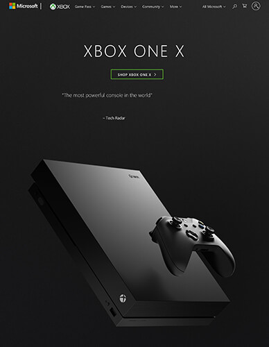
It’s simple, yet very effective — and Xbox understand they don’t need to do too much to show off their wares. The Xbox One console (and virtually every other Xbox console before that) has been a big hit, and when that’s the case, it’s often better to let the product speak for itself rather than go down the route of a hard sales pitch.
The page features nothing but a glorious, high-res image of the console itself, complete with controller…
… plus that killer marketing line: “The most powerful console in the world”, from one of the most respected tech sites/zines in the world.

Continue to scroll down the page and Xbox continues to let the products and tech-specs speak, with auto-play videos and high-res images are designed to show a visitor what they’ll get if they buy the console and play the games.
It’s as though the visitor has been fully immersed in the experience already.
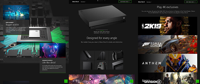
Once you’re done scrolling the page and looking at all the brilliant imagery, you’re left with options to pick a bundle and buy, or compare different consoles to work out the right one.
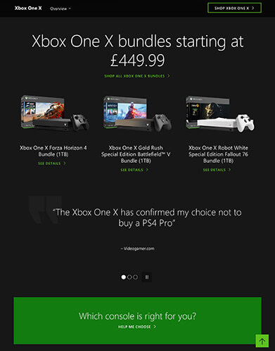
The entire process is designed to make you feel as though you know the console inside and out, before you’ve even had a chance to road-test it for yourself.
Pricing/comparison pages
Don’t have a product to sell? Are you offering a service instead? You can still have a product page … of sorts. Except this time around, it’s a “pricing page” covering a bunch of products or services, rather than a page dedicated to selling the finer points of one particular product or service.
23 – TalkTalk service comparison landing page
If you’re in the market for “internet deals”, you might be inclined to take a peek at what TalkTalk has to offer. It sure sounds good to “Get award winning unlimited broadband for less” — and that kind of language is designed to make you think you’re getting a deal that really does beat the rest, in terms of price, how much broadband you’ll get, and service.
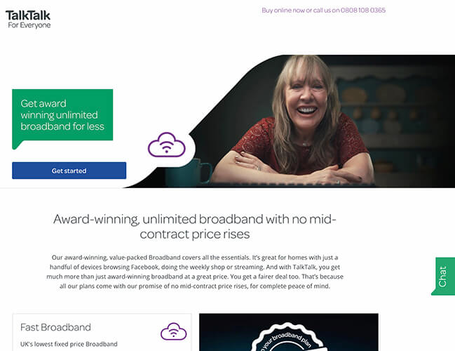
This particular price comparison page gives you just two options, along with a “Get started” call-to-action.
There’s the “Fast Broadband” package, along with the reasons you should pick TalkTalk to be your new internet provider. One of those reasons is the “Limited time offer” which, of course, you’re going to want to show your customers first and foremost. It makes the company look super helpful, pushing the best deal (and not the most expensive one) to the front.
And then there’s the “Fast Broadband + TalkTalk TV + Free TV Box + Entertainment Boost” package, again, along with reasons why you should pick TalkTalk to be your new internet provider.
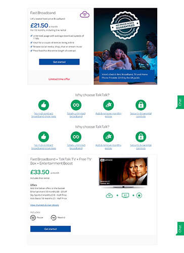
The company offers more packages than that, but by offering just two most popular packages, you’re giving the visitor options without completely overwhelming them.
As a final note, the phone number at the top of the page is NOT a click-to-call number, but it does take you through to an accessibility page on which you can find a number of ways to contact the company, including Live Chat and assistance for those with disabilities that affect sight, hearing, mobility, cognitive response, etc.
24 – Virgin Media internet service comparison page
Virgin Media is also home to an internet service comparison page, but it’s done in a slightly different way to the one seen on the TalkTalk website. Rather than offering just two popular services, one on top of the other, Virgin Media has offered four top services, side by side, making for easier comparison.
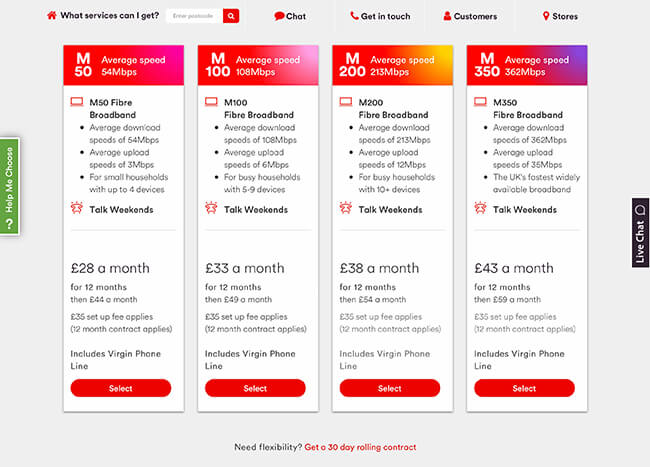
Alternatively, if you ARE offering products rather than services, you can use a pricing or comparison page in the same way to ensure the visitor buys exactly the right model or product for them. This is something that you’ll see on the Xbox website, Apple website, and many more tech companies.
Wrapping it up
You don’t need to reinvent the wheel in order to create a landing page that converts but a little inspiration can go a long way. And, there are some great landing pages out there to take inspiration from.
Both from a design perspective and CRO perspective.
Now, you’ve got some inspiration for your next landing page, it’s time to add your unique spin and create a landing page that’s truly tailored to your audience.
Just remember that whatever landing page design you come up with – it’s just a starting point.
To fully optimize your landing pages, you need to split-test them to find exactly what works for your audience.
Related reading:

