28 Email Sign Up Form Examples You Can Take Design Inspiration From

With so many different types of email sign up forms available these days, it can be really hard working out which one is going to be the right one for you and your site or blog.
Popovers, popups, slide-ins, incentives, freebies … With too many choices and not enough time to make sense of them, I’ve decided to try and make your life a little easier.
I’ve grabbed 28 totally random and popular email sign up forms on the internet and scrutinised them, making a note of tricks that work, features that you may wish to include in your own email sign up for, and a few boo-boos that you should probably avoid.
Are you sitting comfortably?
Let’s get picky about email sign up forms:
Email sign up forms on the homepage
Everyone always thinks that you need to have a flashy, pop-up, all singing-all dancing form to get visitors to subscribe to your email newsletter, but that’s not always the case.
If you deliver great content, services, or products; helpful advice or information; or just something readers enjoy, they’ll WANT to subscribe, no popups necessary.
For those visitors, you should consider adding email forms to your home page or main bulk of your blog or site content, and here are a few ways that you can do exactly that.
1 – Funnel Overload (now Startup Bonsai)
The home page of Funnel Overload (now Startup Bonsai) is designed to capture emails from visitors first and foremost, directing people to helpful content after that.
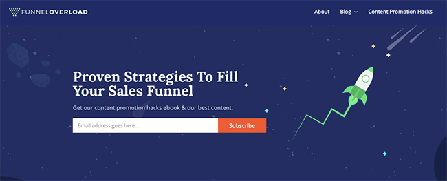
Some might say this style of email capture is a bold move, especially as the visitor might not even be aware of what the site actually offers yet, but there are a few things that help to convince them that they’ll be doing the right thing by entering their email address.
The freebies act as an incentive.
Get our content promotion hacks ebook & our best content.
ONLY for newsletter subscribers, though. A visitor won’t get access to that really, really good stuff unless they hand over their email address.
2 – Vogue (British)
Take a peek at the British Vogue website and you’ll find a similar placement of an email sign up form, but done in a slightly different way.
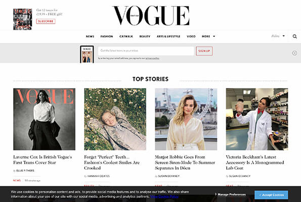
The form is directly beneath the logo and main menu, although it’s not an overly obvious and eye-catching one. It’s been designed to NOT detract too much attention away from the main content.
You have the option to ‘x’ the panel and close it down if it annoys you, but because it’s quite a muted box, it’s not really an annoying or bold feature on the site.
3 – Schuh
The Schuh website has a whole page dedicated to capturing emails on their website …
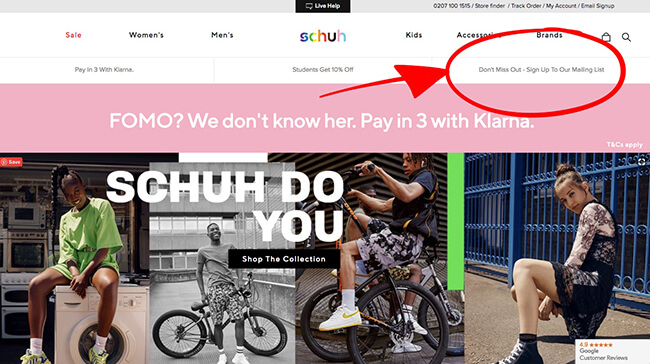
… alongside an email capture form at the bottom all pages, in the footer.
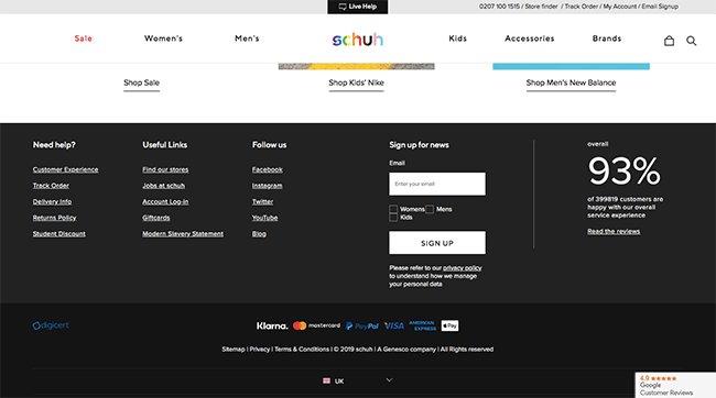
Having multiple opportunities to sign up is a great way of making sure you never miss a potential subscriber, and Schuh shows you how to do it without pushing it in the face of the customer too much. Getting an email address is good, but the retailer is more interested in getting a visitor to buy something.
A long subscriber list doesn’t always mean increased sales.
When a customer does buy something, they’ll hand over their email address in most cases, anyway.
One last thing that I’d like you to take a peek at, on the Schuh email sign up page is the language used.
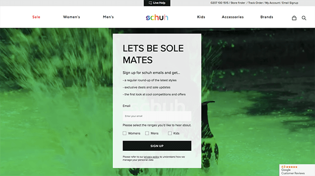
LETS BE SOLE MATES
A play on the words sole/soul makes the signing-up process slightly more entertaining than it otherwise would have been, and the visitor needs to actually, really look at the words to realise the pun. It’s almost like they need to do a double-take — and that means keeping their attention.
*We’re absolutely going to overlook the missing apostrophe and assume it was deliberate.
4 – Lifehack
Another email capture form found on the home page, Lifehack uses something called social proof to convince visitors to sign up.

Look at the strip of big business names directly beneath the first email capture point — it’s filled with names that are meant to make a visitor trust the site, even though that encounter with it is their very first.

The Guardian, The Washington Post, Harvard College … They are NOT names to be sniffed at. And if they’re endorsing this website, the visitor is probably going to feel compelled to do the same thing.
The very same social proof tool has also been used on the homepage of the Blogging Wizard website to achieve the same email-capture effect.
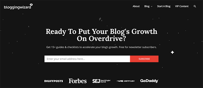
The homepage has changed since but this is still a great example.
Email sign up forms as popups, popovers and lightboxes
5 – HarperCollins UK
This pop-up landing page is a very good example of what marketers like to call a “squeeze” page — you are essentially “squeezing” information (in this case, an email address) from visitors.
Harper Collins does this by offering potential customers a 20% discount on future purchases, which not only encourages people to actually share their personal details (email address), but also buy something.
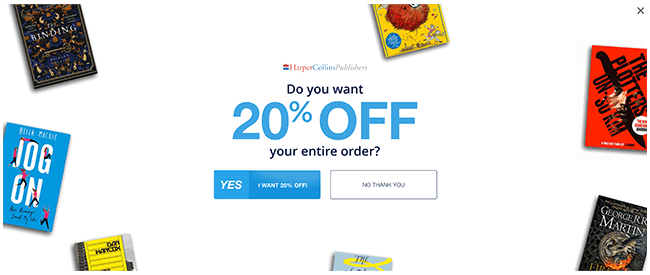
Technically, when you look at it, it’s a double whammy approach.
Aren’t we all more inclined to make that purchase with the promise of 20% (or similar) off the price?
The SOLE PURPOSE of a page like this is to capture email addresses for future marketing purposes, because email lists are everything for businesses, bloggers, marketers, etc.!
I’m not sure if you’ve noticed yet, but accepting (or declining) the discount and entering your email address are virtually the only things you can do on the page, apart from closing it down.
You couldn’t make it any easier for visitors to hand over those precious details!
6 – Blogging Wizard
Blogging Wizard uses a slide-in pop-up not only gives visitors a way to subscribe to notifications of new blog posts, etc., but also get some FREE stuff — an incentive to start typing in those personal details.
15+ guides, checklists AND templates to grow your blog faster … and for FREE?!
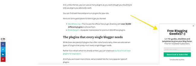
Well, that’s an offer that’s too delightful to turn down, right?
Giving visitors an INCENTIVE to sign up to your email list, which in turn gives you the potential to create an amazing funnel for traffic, sales and more, is the fastest and easiest way to capture email addresses.
And what’s an email address?
Yes, that’s right: it’s a foot in the door!
You could offer potential subscribers a whole host of things — special discounts, access to free stuff in a resource library, downloadable items, bonus content, and much more besides. Advertise it all via the means of a pop-up on your website and your email list will be growing in no time!
7 – Ray-Ban
Another day, another pop-up, this form of email capture has become one of the most popular. It’s not hard to see why, especially when you look at Ray-Ban’s website as an example.
When something pops up on the screen, the visitor has no choice but to take action with it. They can either use the “X” and carry on what they were doing …
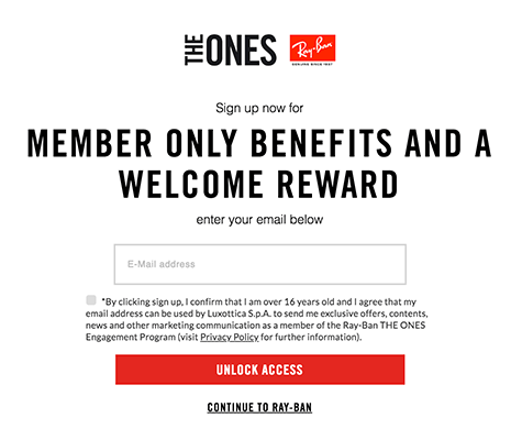
… OR they can sign up to be a member of something, get a reward just for becoming a member, and get a bunch of benefits, just for entering something as simple as an email address.
Pay particular attention to the use of language on the red button — “UNLOCK ACCESS”. It’s designed to make you wonder about those benefits or rewards and sign up for yourself.
The FOMO is strong (Fear Of Missing Out).
8 – Shein
On the Shein fashion website, you’ll see an example of what marketers like to call a scroll box (or slide-in) email sign up form.
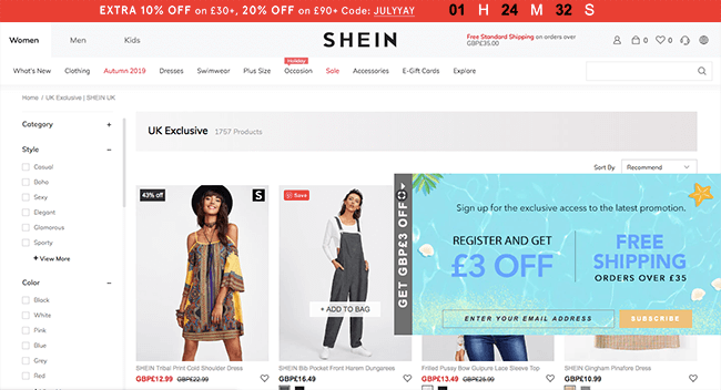
A visitor is required to roll their cursor over a panel on the right hand side of the screen, which in turn opens up the email sign up form. This is both a good and bad idea in equal measures.
It’s bad because it’s easy for a visitor to miss or skip – the popover doesn’t appear on the screen until the user commands it to, and they might not do that.
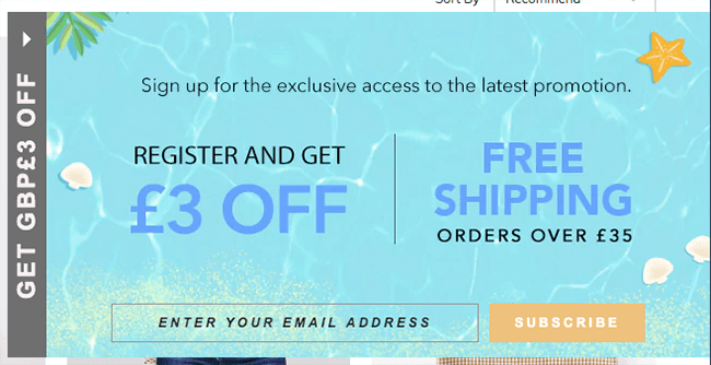
In the same sense, it’s a good email sign up form. The visitor isn’t interrupted by something popping up on the screen when they’re trying to shop.
9 – Dr. Martens
The Dr. Martens website offers up another example of an email address capture page — one that is commonly referred to as an entry or entrance popover or popup.
It appears on the page within seconds of a visitor landing on it, without the need for a cursor-roll or similar, demanding an action or attention.
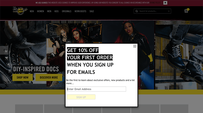
An entry popover is actually disruptive for a visitor. It prevents them from doing whatever they were doing. Not only that, the website is asking a potentially brand new visitor/customer to hand over their details even though they might be completely unfamiliar with the company.
To counteract that disruptive intrusiveness, Dr. Martens and many other sites usually offer an incentive, almost like compensation.
Sorry for the pop-up inconvenience and stopping you from shopping with us for a moment, but if you do decide to hand over your details even though you might not know anything about us, you’ll get 10% off your first order!
If you’re asking for my personal advice, I recommend ALWAYS offering a discount, freebie or other incentive when using an entry popover email sign up form.
(You’ll find more info about email sign up incentives if you keep reading!)
As a final note, the email sign up form isn’t in the centre of the page and I find that truly irritating.
10 – Kylie Skin
The new Kylie Skin website doesn’t offer you discounts or deals when it asks you to sign up for the email newsletter, but what it does instead is actually quite clever …
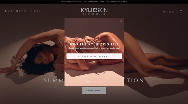
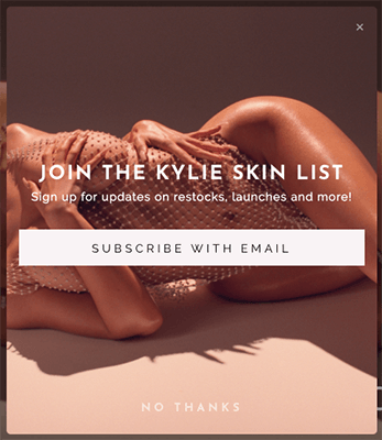
The popup appears within a few seconds of the page loading, which some people would just exit and continue to browse.
It’s only as you start scrolling down the page that you realise why that email address sign up form deserved a little more attention …
So many of the products are out of stock!
The website still gives you the opportunity to “join the list” so that you’re subscribed to get notifications for restocks with a click-to-open box at the bottom-left of the page.
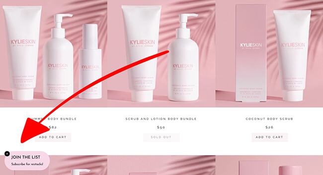
Most of Kylie Jenner’s beauty products sell out right away, so a discount or deal isn’t necessary to capture email addresses. A restock notification, on the other hand, is guaranteed to get fans to hand over their details.

Finally, just like so many other websites, there’s a space to sign up for the email newsletter at the bottom of the page too, in the footer, appearing on every page … as is that “join the list” open-up popover on the bottom-left-hand-side.
11 – Kat Von D Beauty
We aren’t dishing shade at all when we say this, but many of the Kat Von D Beauty products are *in stock* on the website, so offering in-stock notifications probably wouldn’t work to the company’s advantage.
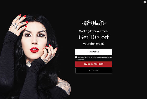
What this website offers in the entry popup and popover instead is a 10% discount code – as a gift – to save you money on products you were already thinking of buying. That’s why you’re on the website in the first place, right?
Make note of the language used on this call-to-action button: “claim my free gift”.
It’s a discount code, yes, but it’s a special gift discount code just for the visitor, just for signing up. Everyone loves money off something they were already thinking about buying!
12 – HomeOwners Alliance
HomeOwners Alliance’s type of popup doesn’t appear immediately after the page loads, like the examples you’ve already seen. Instead, the email signup form appears after a specific lapse of time (30/60 seconds, etc.), or once the visitor has scrolled to a certain part of the page.
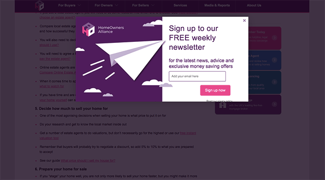
This form appears once you’ve got about halfway down the page.
A timed popup is more preferable to an entrance popup because it gives the visitor a chance to have a little look around and get a feel for the site and what they’ll get from it, before putting them on the spot and asking for their personal details.
It also means that not everything is rushing to load at once, potentially slowing the site down.
13 – Expert Photography
This email sign up form serves as an example for not just an exit popup, but also for using incentives and freebies to lure in new subscribers.
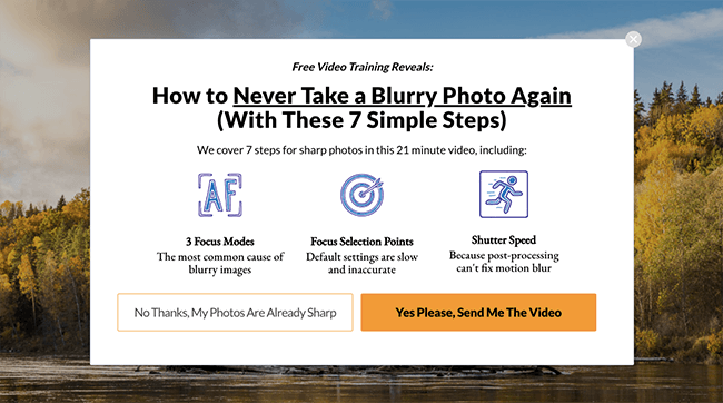
An exit or exit-intent popup is one that pops up when the site believes a visitor is going to leave without taking further action — a last final ditch to grab some details before you lose them forever.
In order to make sure the site absolutely grabs the attention of the visitor before they leave, a freebie is offered that is too good to turn down.
The visitor will get a completely free 21-minute video, covering 7 steps, to ensure better, sharper photos. They know that because the site tells them, and that reassures them that they’re getting something worthwhile in exchange for the email address.
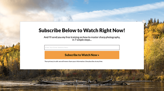
The visitor knows they won’t just get a 5-minute video that doesn’t cover what they need to learn; they know that they’ll get a pretty in-depth video, covering a wide range of problems, and finding solutions to all of them.
That, to someone who is interested in making their photos better, will be information that actually is too good to turn down.
14 – Victoria Beckham
This minimalist, monochrome popup appears after a few seconds of being on the page, but I’d like to draw your attention to the Victoria Beckham email sign up form’s checkbox options – “Fashion”, “Reebok”, and “Beauty”.
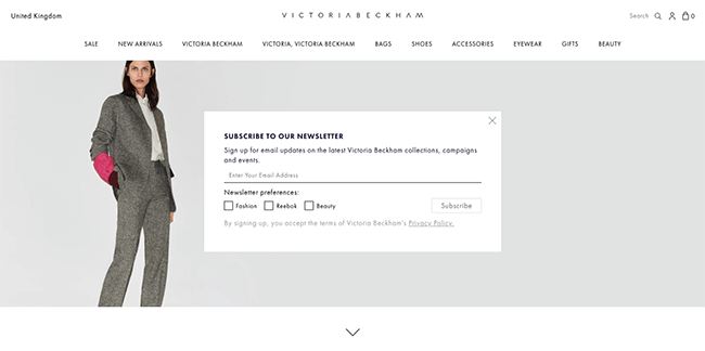
This allows a reader to specifically pick and choose which marketing materials they receive, making the newsletter much more tailored to them, and also much more relevant.
It also makes the visitor feel as if they are more in control of what emails they receive; they can leave out the stuff they’re not interested in, while still getting information on the stuff they are.
15 – Tech Crunch
While I’m on the subject of having options, I have another fabulous example to show you of just that — the Tech Crunch site.
When you sign up for the newsletters, you can pick and choose which ones you want to get in your inbox, preventing you from getting a load of stuff you’re not interested in and then unsubscribing.
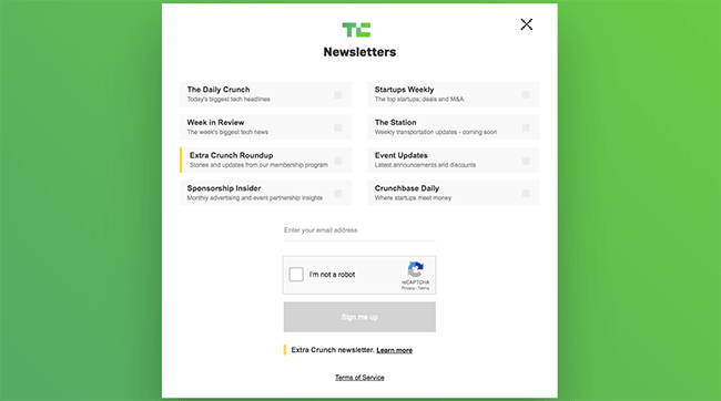
It’s all good and well getting people to hand over those email address, but you’re going to want to keep them on the list too!
Email sign up forms in the sidebar
Many blogs and websites have a sidebar — a bar that runs from the top to the bottom of the page, at the right or left-hand-side, containing widgets, such as links to social media accounts, advertisements, etc.
It’s a great place to have a permanent email sign up form, as it means the viewer will see it – and have the ability to sign up – on every page the sidebar appears.
Unfortunately, sidebars don’t appear in the same way on a mobile device as they do on a desktop or laptop.
The bar is usually shifted to the bottom of the page, beneath the main bulk of content (home page, blog post, etc.). Unless a visitor scrolls all the way down there, there’s a chance they’ll miss that sign up box entirely.
You MUST be prepared for more people to check out your website or blog on a mobile device than a desktop site.
If you ONLY have an email sign up form in a widget on the side bar, you’re going to miss many, many potential subscribers.
16 – Pixiewoo
One of the most popular beauty blogs in the UK – Pixiewoo – is a classic example of how an email sign up form can neatly fit into the sidebar.
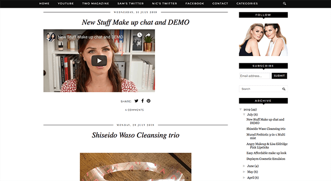
The same email sign up form DOES NOT appear, not even at the bottom of the page, on a mobile device, however. In this case, another email sign up form (in-page or popups/lightboxes) would be helpful to capture the details.
17 – The Dish Daily
Another sidebar example — and a very, very simple one — is on the The Dish Daily website, voted #5 on Lifehack’s Top 10 Best Blogs Around the World That Will Inspire Your Life.
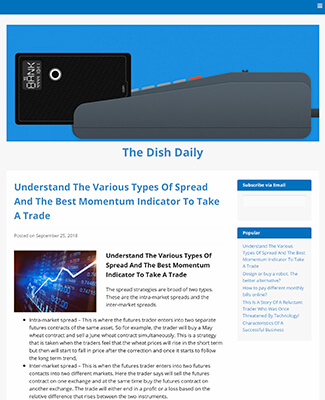
No gimmicks, no fuss, just plain and simple. If they want the latest gossip, they’ll need to subscribe via email.
And the email sign up box *does* appear at the bottom of the page on a mobile device, unlike with Pixiewoo.
18 – Gary Vaynerchuk
This lifestyle blog came in at #1 on the same Lifehack Top 10 Best Blogs Around the World That Will Inspire Your Life list, and is also home to another sidebar email signup form.
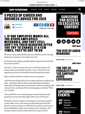
The sidebar isn’t seen on the homepage, but as soon as you click on a post it loads on the right right-hand-side. It’s there and clear, but not in your face or overly obvious. Definitely an example to take inspiration from if you have a sidebar on your blog or site.
Email sign up forms in the footer
Quite a few websites have a small, discreet email sign up form at the bottom, usually in the footer or just above it.
It’s a way of making sure the sign up form is on the page – every page – without shoving it down a visitor’s throat (so to speak), and can still be made to look appealing and somewhat eye-catching to still get people to pop their email address in the box.
19 – Tasty
Tasty is perhaps better known for creating those amazing-looking food videos on Facebook that make you feel as though you’re a five-star chef … even when you’re not!
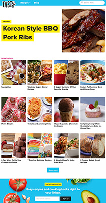
This website has a space in the footer for an email sign up form, although it’s definitely not meant to fade into the background. The space has been made bright and colourful, decorated with images of tasty ingredients. If you scroll down that far, you’ll DEFINITELY notice it.
Easy recipes and cooking hacks right to your inbox.

The wording of the call-to-action is designed to sound as though they can make cooking easy, with lots of hacks that’ll help you become a master chef in no time.
Yes, YOU. You really could cook dishes like that … but first, they’ll need your email address.
20 – EA / The Sims 4
If you were to go looking for more information on The Sims 4 (one of the most addictive games on the planet, if you ask me), you’d probably come across the EA website — they have placed the email sign up form towards the bottom of the page.
Not really in the footer; just above it, and above the section featuring other Sims games.
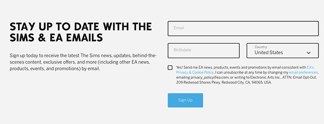
I’m a DIE-HARD Sims fan, so I signed up for the email newsletter many, many years ago — and I’m glad I did.
I’ve since signed up to further memberships to save money on games, occasionally get access to early discounts and sales, and I know when the latest add-on and extension packs are available so I can clear my schedule and make sure nothing gets in the way of me and many solid hours of gaming.
The signup form makes it clear EXACTLY what you’re signing up for! People [like me] like to know what they’re getting in advance.
21 – Skinny Dip
Another example of the footer email signup, this one’s throwing in some sale previews, exclusive treats, AND a 10% off code — which really is getting the most for that email address!
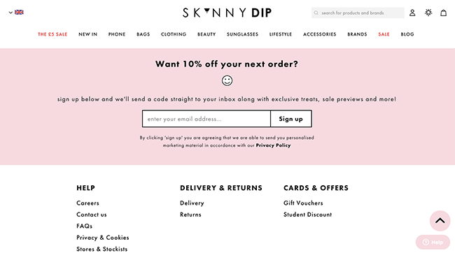
Incentives are actually a really great way to get your visitors interested. You’re giving something back in return for that email capture, and the visitor is also getting something out of it too. Or, in this case, lots of things – previews, treats, discounts …
Let’s talk a little more about incentives …
Email sign up forms that offer incentives or freebies
If you absolutely, definitely want your website or blog visitors to hand over their details, you’re going to need to give them a reason to, especially if you’re asking for those details fairly early on in the relationship.
There are plenty of ways to give your visitors something back, and I’ve compiled a few ways you can do it that don’t just rely around a discount code.
22 – Costa Coffee Club
If you drink a lot of Costa Coffee and you’re smart (like me), you’ll sign up to the Costa Coffee Club, which is a loyalty scheme to give something back to the customer dressed up as a great way to collect email addresses and other data which can then be used for marketing purposes.
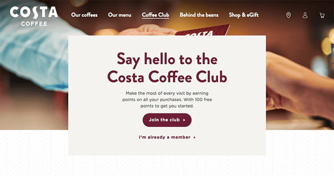
It’s fairly typical of a loyalty scheme — you earn points for spending money, allowing you to grab free coffees, cakes, etc. once you’ve earned enough.
And as a bonus, you get regular emails telling you all about the latest offers, promotions, and new products, which will entice you to go in, buy stuff, and earn points … which will make you go back in again to redeem them!
23 – Amy Shamblen
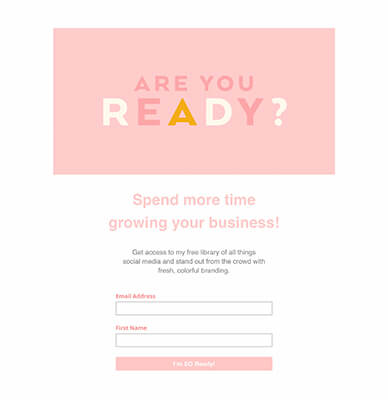
You can take a similar approach as a blogger with a password protected area — give visitors and loyal followers access to a ‘resource library’ full of really, really good stuff in exchange for an email address.
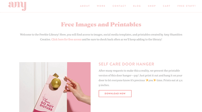
The visitor signs up, and in the first welcome email they are given a link to the resource library along with a password that gives them access. They can’t get access without handing over an email address, but they can see a snippet of the good stuff they’ll get access to, if they do.
24 – Thomas Sabo
How does £10 off that item were thinking buying anyway sound? That’s what you’ll get if you sign up to the Thomas Sabo email address, situated right at the bottom of the page, in the footer.
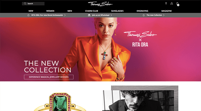
It’s a simple, yet effective strategy — give your visitors an INCENTIVE to hand over their email addresses and get on your marketing newsletter list.

25 – Bag Borrow or Steal
Some email sign up forms are muted and minimalist, such as on the Vogue website, but not the email sign up form on Bag Borrow or Steal. This website uses a number of tricks to get visitors to sign up.
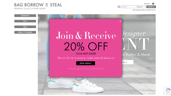
Firstly, the entry popover itself is big (covering a lot of the page), bright, bold and very eye-catching. It’s bright pink – quite the contrast from the rest of the black, white and otherwise neutral-looking page.
A visitor will also bag [pun intended] themselves 20% off if they sign up … but only off the price of their first order.
And when they get to the page where they start inputting their details, they’re being invited to become part of a “squad”, designed to make a visitor feel included, well-rewarded, and special.
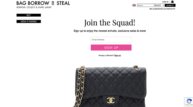
That’s a whole load of incentive, right there — all boldly and brightly done.
26 – Self-Publishing School
As far as freebies or incentives go, this one could just be one of the best. You’re getting a whole FREE BOOK full of tips on how to become a best-selling author in as little as 90 days!
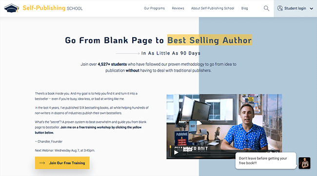
The little click-to-open popup on the bottom-right-hand-side of the page is always present, making it always accessible, and the wording has been used to stand out and truly appeal to a visitor browsing the site.
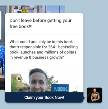
Don’t leave before getting your free book!!!
It’s a bit like your mum calling after you … “Don’t forget to take your lunchbox with you!”
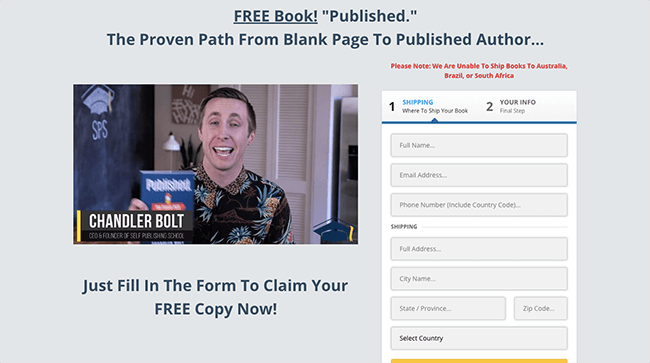
Familiar, friendly, and conversational; people didn’t know about that free book before, but it’s probably piqued a visitor’s interest at least enough to have a closer look. And if that wasn’t quite enough, the videos explaining what you’re about to get will put their mind at ease and convince them.
Email sign up forms for memberships
Membership-style schemes are a great way to encourage visitors to hand over their email addresses, but only if the membership is actually worth signing up for …
27 – Nike Exclusive Membership
Without a membership (starting with the capturing of an email address), there are certain styles and designs of trainer that you won’t be able to buy on the Nike website.
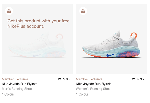
You actually have to become a part of that special little club if you want to get your hands on any of the “locked” designs.
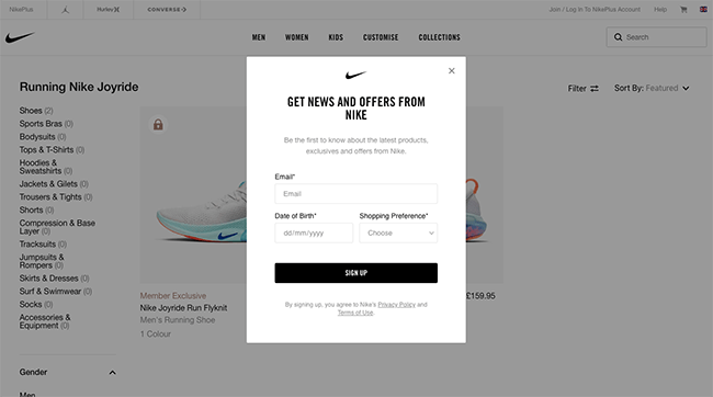
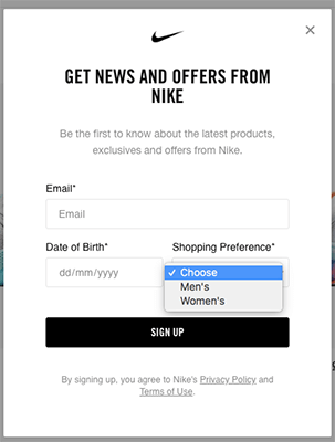
The club is free to join — something the product page makes very obvious — which means the visitor has nothing to lose and perhaps a few special/limited edition trainer designs to gain.
I obviously couldn’t tell you what Nike’s conversion rate for email captures was like, but with an exclusive membership style like that, I can imagine it’s fairly high.
28 – Groupon
Discount sites like Groupon often take a similar approach to email capturing — you can’t actually do much on the site until you register with your email address.
If visitors want to get to the great deals and offers, they’ll have no choice but to share those details. They can look, but they can’t touch.
One important and interesting thing to notice about the Groupon popup is that the popup can only be exited by the visitor either clicking yes or no (essentially).
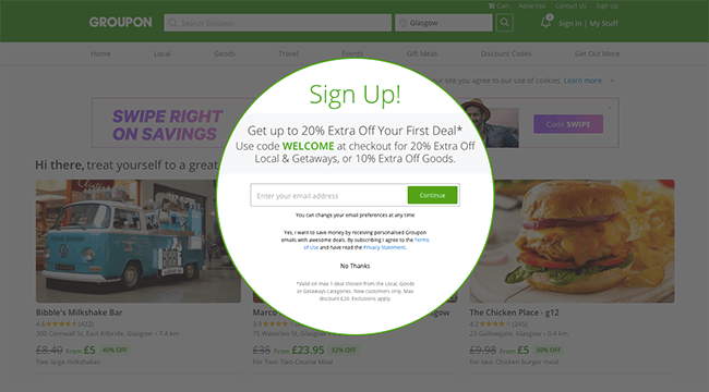
You can enter your email address and continue, or you can say “No Thanks” to the additional 20% off your first service or 10% off your first order of goods.
People aren’t overly comfortable saying no to things, and if they’re going to need to take an action that isn’t just “x” out of the popup, it might just be the email capture one. There’s a 50/50 chance, rather than just 33.3%.
Wrapping it up
We’ve talked through plenty of examples of email sign up forms.
Now it’s time to take inspiration from the design, copy, and layout of these forms to grow your email list faster.
In the same way that you would build landing pages with audience personas in mind, you need to do the same thing with your email forms.
If you haven’t created an audience persona yet – you’ll need to create one (or several) before you get started.
But, most importantly:
The form you create is only a starting point. You can take all of the best practice CRO advice in the world, but the only sure-fire way to know what works is to test.
So, you’ll need to use an opt-in form tool that allows you to test different forms against each other. If you use WordPress, one of the best options for this type of thing is Thrive Leads.
But regardless of which tool or WordPress plugin you use for creating your forms – make sure it offers split-testing. Otherwise, you’re just guessing.

