Looking for the best email newsletter software to grow your business?
You know email still drives results, but picking the right tool can feel overwhelming. There are so many options, and not all of them are beginner-friendly or budget-friendly.
That’s why I’ve tested and rounded up the best email newsletter software tools right now. Some are free, some are paid, but all of them help you build, send, and automate newsletters that actually get opened, clicked, and acted on.
By the end of this post, you’ll know exactly which tool fits your business and your budget.
The top email newsletter software tools – summary
TL;DR:
- MailerLite – Best overall. Powerful free email newsletter software + affordable paid plans.
- Kit – Great creator-focused features.
- Moosend – Easiest to use but doesn’t skimp on features.
#1 – MailerLite
MailerLite is my overall favorite email newsletter software provider. It’s surprisingly affordable too. It gives you much more bang for your buck compared to its competitors, with a range of low-cost plans for businesses with a limited number of subscribers or less and a very generous free option.
Despite its affordable price tag, MailerLite hasn’t cut any corners. It still offers a broad range of email marketing and automation tools, including a powerful workflow builder, flexible drag-and-drop newsletter editor, and various segmentation, tagging, and personalization features.
And that’s not all. On top of all the email stuff, MailerLite also comes with a landing page and signup form builder, email verifier, ecommerce features, etc. There’s even an integrated website builder that you can use to build your entire site from the ground up, complete with blogging functionality.
The drag-and-drop newsletter editor UI isn’t quite as easy to use as Moosend’s, but it’s very flexible. You can drag in all the usual content blocks to build your newsletters, as well as special blocks like interactive carousels, event RSVPs, ecommerce blocks, email surveys, and more.
And if you don’t like working in a drag-and-drop interface, you can create HTML email templates for your newsletter by using the rich text editor or HTML editor.
But our favorite thing of all about MailerLite is that it supports paid newsletters. That’s right, you can use MailerLite to sell digital newsletter subscriptions and collect recurring payments from your subscribers.
This works hand-in-hand with MailerLite’s powerful automation tools. For example, you can upsell your paid newsletter subscriptions to the regular subscribers that are most likely to purchase using automated, targeted workflows.
And because MailerLite lets you add unique newsletter blocks like surveys and quizzes, you can create newsletters that are actually worth paying for. No other email newsletter software comes.
Key features
- Low-cost plans
- Three newsletter editors
- Email verifier
- Page and form builder
- RSS to email
- Ecommerce features
- Website builder
- Blogging functionality
- Interactive newsletter blocks
- Paid newsletter subscriptions
- Automation workflow builder
Pros and cons
Pricing
You can get started with the free plan, which is good for up to 500 subscribers and 12,000 monthly emails.
Paid plans start at $10/month for unlimited monthly emails. The more subscribers you have, the more you’ll pay. Annual discounts available.
Read our MailerLite review.
#2 – Kit (formerly ConvertKit)
Kit is a great email newsletter tool for content creators. It’s designed specifically for creators like authors, bloggers, online coaches, and podcasters.

The newsletter editor is a little basic, so it’s not ideal for creating flashy HTML-based emails. But if you just want something that’s easy to use and is focused on getting emails into inboxes – it’s a great option.
And that’s one thing that’s particularly great about the platform – email deliverability rates. This is key to an effective email marketing strategy.
The interface is really intuitive. You can build simple automations using rules or a visual automation builder – no need to mess around with complex workflows. That said, you can create workflows that are more complex if you like.
They do have a nice selection of newsletter templates. These fit a variety of use cases but they’re specifically aimed at creators.
With some other newsletter software, I find myself sifting through huge amounts of templates and hardly any are suitable for newsletters. That’s not the case here.
There’s also a paid recommendations feature which can be useful for giving your email subscribers a boost.
One thing worth noting is that there is a free newsletter plan that supports a large number of email subscribers. However, this plan is heavily limited and seems to exist primarily to expand the reach of their paid recommendations feature. Still, very neat regardless of this!
Key features
- Landing pages
- Sign-up forms
- Email automation
- Ecommerce functionality
Pros and cons
Pricing
You can get started with a free plan. Paid plans start from $39/month or from $33/month with yearly billing.
Read our Kit review.
#3 – Moosend
Moosend is an all-in-one email marketing platform that comes with all the tools you need to manage your entire email campaign from start to finish.
One of the reasons we like Moosend so much is because of how scalable it is. The price depends on how many email subscribers you have, so if you’re just starting to build your list, you’ll pay as little as $9/month and still get access to all the core features.
Those features include a powerful newsletter editor, CRM (customer relationship management) system, segmentation and personalization tools, landing page designer, automations, and analytics.
Moosend has a simple drag-and-drop editor that helps you to build stunning, rich multimedia email newsletters without any HTML knowledge. You can add in images, videos, and tons of interactive elements.
It works like this: First, you drag and drop ‘layouts’ onto the page to create the structure of your newsletter. You can use layouts to split the email up into rows and columns, which looks a lot prettier than one long block of text.
Then, you drag in items. Items are essentially content blocks (like in WordPress), and there are blocks for images, text, buttons, social media links, timers, videos, and more. There’s even a nifty ‘product’ block that comes in really useful if you’re running an ecommerce store. It adds product recommendations to your emails, alongside buttons that subscribers can click to head to your product pages.
You can also use ‘conditional blocks’ to show unique content based on the subscriber profile and launch more personalized campaigns.
And if you don’t want to build your newsletters from scratch, you can browse Moosend’s catalog of designer-made templates and customize them as needed.
Another feature we really like is Moosend’s AI-powered subject line generator, Refine. It helps you to create subject lines that drive more opens and clicks, estimates how well they’ll perform, and provides suggestions on how to improve.
There’s a lot more we could say about Moosend. We’ve not even scratched the surface yet or looked at any of the other tools like the automation builder and landing page editor. But you can try them all out for yourself with a 30-day free trial.
Key features
- Drag and drop newsletter editor
- A/B testing
- Segmentation
- Analytics & reporting
- Automation builder
- Email, automation, and page templates
- User and website tracking
- Landing pages
- Form builder
Pros and cons
Pricing
Plans start at $9/month for up to 500 subscribers. The more subscribers you have, the more you’ll pay.
Custom enterprise plans are available, and you can get started with a 30-day free trial.
Read our Moosend review.
#4 – GetResponse
GetResponse offers email newsletter software that also includes a bunch of other marketing features. It has a very broad feature set and can be used to build your entire website and marketing funnels from the ground up.
The drag-and-drop newsletter builder on GetResponse is great. It’s easy to use and comes with a free image library, from which you can grab graphics and other visuals to use in your newsletters.
But it’s GetResponse’s funnel builder that’s the star of the show. You can use the platform to quickly set up funnels complete with lead magnets, landing pages, and follow-up email sequences that generate leads and nurture them to conversions.
GetResponse started off as simple email marketing software but has since grown into a much more useful platform with
Key features
- List building tools
- Funnels
- Personalization and segmentation
- Website builder
- Email, SMS, and web push
- Webinars
- Landing pages
- Forms
- Free image library
- Drag-and-drop newsletter creator
Pros and cons
Pricing
There’s a free plan for up to 500 contacts. Paid plans start at $13.30/month.
Read our GetResponse review.
#5 – Omnisend
Omnisend is the best email newsletter software for ecommerce stores. Use it to design newsletters and create targeted, automated messaging campaigns.
Again, you get all the email features you’d expect with Omnisend: a content editor to design your emails, an expansive template library, an automation builder, etc.
But on top of all that, you also get some powerful SMS and web push notification tools, which help you to send highly-targeted messages to your customers across multiple channels.
Now, their library of email newsletter templates is not as significant as other platforms. But their drag & drop newsletter designer more than makes up for this.
I usually find that most email templates don’t have the elements that I need anyway. So I appreciated the ability to design my own using pre-made blocks.
It’s also worth noting that Omnisend’s interface is designed to be very beginner-friendly. It’s one of the easiest to use that you’ll find. But it’s important to note that this newsletter software is aimed at ecommerce stores specifically.
Key features
- Marketing automation
- Email marketing
- Content editor
- Template library
- SMS
- Web push notifications
- Popups and forms
- Segmentation
- Reporting
Pros and cons
Pricing
The free plan lets you reach 250 contacts and send 500 emails/month. Paid plans start at $16/month.
Read our Omnisend review.
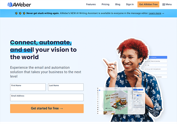
#6 – AWeber
AWeber is one of the longest-standing email newsletter software platforms around. It’s known for its best-in-class newsletter templates and design tools. It’s the only platform we’ve seen that has direct integration with Canva (a popular online graphic design tool).
Like the other platforms we’ve looked at so far, AWeber comes with all the core features email marketers need, such as:
- A sign-up form and landing page tool to help you collect leads and grow your list
- A drag-and-drop email builder to help you design professional-looking newsletters
- Automation tools to help you run your email campaigns on autopilot
- List management tools to help you segment your subscribers
- Dynamic content to help you personalize campaigns for different segments
- Analytics so you can see what’s working and what’s not
But there are a couple of things that make AWeber stand out. First off, their newsletter templates are next-level. There are over 600 customizable, responsive templates to choose from, including industry-specific templates for pretty much every niche, promotional templates, holiday templates, etc.
You can customize all templates by choosing a color scheme, adjusting the layout and design, and adding your own logo, photos, and content
Secondly, there’s the Canva integration. AWeber is the only platform we’ve tried that lets you create images on Canva and use them in your emails without ever leaving that platform.
There are also thousands of free high-quality stock images for you to use in your newsletters if you don’t want to create your own.
Another standout feature is AWebers Auto Newsletters. You can use it to send out automated emails to your subscribers to let them know whenever you publish a new blog post, product, video, podcast, or anything else.
And there are tons of other pre-built autoresponders for things like welcome sequences, abandoned cart emails, order confirmations, etc. that you can roll out in a few clicks.
We’re also big fans of AWeber’s analytics tools. Reports are easy to read and help you to get a bird’s eye view of all the metrics that matter. There’s also A/B split testing to help you compare different versions of your newsletters and see which performs best.
Key features
- Sign-up forms
- Auto newsletters
- Canva integration
- Lots of email templates
- A/B testing
- Stock image library
- Analytics
- List management
- Landing pages
Pros and cons
Pricing
AWeber offers a free plan for up to 500 subscribers. Paid plans start from $14.99/month, annual discounts available.
Read our AWeber review.
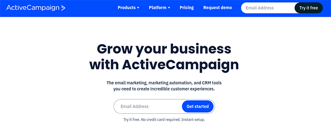
#7 – ActiveCampaign
ActiveCampaign is ideal for those who need an email newsletter software with extremely advanced automation functionality.
Like the other tools we’ve looked at so far, you can use ActiveCampaign to design beautiful newsletters in a drag-and-drop email designer.
But what makes this platform special is its advanced automation capabilities. The machine learning-powered automation builder is the most flexible we’ve seen and has some sophisticated features that other tools lack. You can use it to set up really complex workflows and create personalized experiences for your customers at every touchpoint.
Emails can be triggered based on things like purchases, site visits, engagements, etc. You can even pull data from other digital channels like social media and live chat and feed it back into your automations.
And if you don’t want to mess around building automations from scratch, you can take advantage of the platform’s rich catalog of hundreds of pre-built templates.
There are ready-made automations for things like abandoned cart emails, 7-day welcome series, and more — plus hundreds more in the marketplace.
ActiveCampaign also stands out when it comes to personalization. You can target all your emails to different audience segments based on any factor you can think of, and personalize them with Conditional Content.
And that personalization doesn’t end at emails. You can also use ActiveCampaign send out personalized SMS messages and deliver personalized website content to visitors, depending on what plan you sign up for.
All of these features are built on top of ActiveCampaign’s CRM (customer relationship management) system. The CRM lets you see how your subscribers are engaging with your messages. You can use it to track goals, automate contact management, score leads, and keep your entire sales process working smoothly.
Key features
- Drag and drop newsletter editor
- Advanced automation builder
- Pre-built automations
- Transactional emails
- Personalized content
- Landing pages
- CRM and sales automation
Pros and cons
Pricing
Plans start at $19/month but depend on your number of contacts. A free trial is available.
Read our ActiveCampaign review.
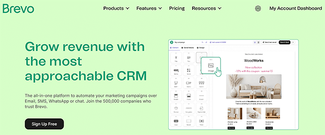
#8 – Brevo
Brevo is the best email newsletter software for SMBs. It includes all the usual tools email marketing teams need plus some cutting-edge features like automatic send time optimization.
With Brevo you get email marketing platform with a rich email designer, live chat tool, CRM, marketing automation, segmentation, landing pages, and a unified inbox to keep your team organized.
One of our favorite things about the platform is the intelligent sending features. For example, you can use the machine learning-powered send time optimization to make sure your emails are sent out at the perfect time to maximize opens and clicks.
Brevo prices depend on monthly email volume, rather than contact list size. This makes it potentially very expensive if you send lots of emails to your subscribers, but great value if you have a large list and low monthly email volume.
Key features
- Email marketing tool
- SMS
- Live chat
- Inbox management
- CRM
- Marketing automation
- Forms
- Landing pages
- Transactional email
- Intelligent sending
- A/B testing
Pros and cons
Pricing
There’s a free plan for up to 300 emails per day. Paid plan prices start at $9/month but depend on how many emails you need to send monthly. Annual discounts available.
Read our Brevo review.
#9 – Constant Contact
Constant Contact is a digital marketing platform that gives you a bunch of tools rolled into one. That includes email marketing software and more.

Constant Contact makes growing your email list really easy. You can use landing pages, text-to-join, Google Ads, and more to get subscribers signing up fast.
Once you’ve built your list, you can engage them with professionally designed emails. There are hundreds of templates to choose from, plus pre-built automation sequences for common scenarios like welcome emails, birthday emails, or re-engagement campaigns.
One of the biggest selling points is deliverability. Constant Contact boasts a 97% inbox rate, so the majority of your emails should actually reach your subscribers. Although, I haven’t seen any third-party research that supports this data.
Beyond email, the platform also offers social media marketing tools and event management features. Planning an event? Constant Contact lets you build registration forms, sell tickets, send invitations, create social posts, and track registrants in real-time.
The only downside to note is that while the feature set is strong, some users report that customer support can be hit or miss. It’s something to keep in mind if you anticipate needing a lot of hand-holding.
Key features
- Email marketing
- Email newsletter templates
- Sign-up forms
- Integration with popular marketing tools and platforms
- List building features
- SMS
- Marketing automation
- A/B testing
- Landing pages
- Event marketing
- SMS marketing
- Social media marketing
- Mobile app
Pros and cons
Pricing
Plans start at $12/month. Free trial available.
#10 – Mailchimp
Mailchimp is a super easy-to-use email newsletter software platform with a generous free plan and some nifty time-saving features.

Mailchimp comes with a solid set of creative tools. You get hundreds of pre-designed email templates, a content studio to store and edit images, and an AI-powered creative assistant that helps keep your designs on-brand. There’s also a subject line helper to make sure your emails get opened.
Automation is well covered too. You’ll find pre-built templates for abandoned cart emails, welcome sequences, and re-engagement campaigns. The Customer Journey Builder and predictive list segmentation add some extra flexibility if you want to get more advanced with your email marketing.
I used Mailchimp for years. It’s reliable for the most part, but the free plan has attracted spammers in the past, which hurt email delivery rates.
Key features
- Customer Journey Builder
- Prebuilt newsletter templates
- Content optimizer
- Creative assistant
- Dynamic content personalization
- Subject line helper
- Analytics
Pros and cons
Pricing
A free plan is available. Paid plans start from $13/month.
#11 – HubSpot
HubSpot is our top-recommended tool for enterprises. It’s the most comprehensive CRM around, with a suite of enterprise-level features that large businesses will appreciate.

HubSpot might be overkill if you just want to create simple newsletters. But if you’re looking for an all-in-one marketing automation solution, it’s a great choice.
You can use it to manage all your customer interactions and marketing campaigns, it’s a great choice.
There are various ‘hubs’ to choose from depending on what software you need. For email marketing and newsletters, choose their marketing hub. Higher-tier plans are expensive but their entry-level plan is affordable even for small businesses.
Key features
- CRM
- Email automation
- Different software ‘hubs’
- Landing pages
- Live chat
Pros and cons
Pricing
HubSpot offers several free tools. Email marketing and automation are included in their Marketing Hub Starter plan, which costs $15/seat per month.
Final thoughts
The best email newsletter software for you depends on your business, your audience, and your budget.
Some of the tools on this list are perfect if you’re just starting out and don’t want to spend a dime. Others are better if you need advanced automation, analytics, and integrations.
The good news is you don’t have to guess. Test a few of these platforms, see which one feels right, and start sending newsletters that actually get results. Your audience is waiting, and your next big conversion could be just one email away.
Related Reading: 20+ Email Newsletter Ideas For Your Next Campaign.
Disclosure: Our content is reader-supported. If you click on certain links we may make a commission.