How To Keep Your Blog Looking Fresh: Follow These Simple Graphic Design Trends
Graphic design has become a hot topic in branding in the past few years.
It’s clear to see that bold colors, mind-bending gradients, and futuristic compositions have dominated the design world.
In 2020 there will be a shift in design where blogs, websites, and ads will start feeling reserved, harmonious, and natural. Except for the use of illustrations, that’s where the fun is.
In order to have your blog looking fresh and trendy in a long lasting way, knowing which trends work is important.
Let’s explore some of the hottest graphic design trends so that you can have a popping blog.
What is graphic design?
Before diving deep into the trends, it’s important to understand what graphic design is.
Graphic design uses photography and illustration to visually communicate messages.
Elements of graphic design include: color, shape, typography, and logos.
These elements are used in conjunction with each other or in opposition to one another so that you are able to create visually impactful designs.
Companies use graphic design to convey the message of the product or service they are selling through branding and logos.
Graphic design feeds your brand and your brand feeds your business.
Why you should pay attention to trends
Graphic designer Paul Rand said:
Design is the silent ambassador of your brand.
Graphic design and branding are closely tied together.
In order to have branding that is successful for your blog you need to know what graphic design trends are popular because they work.
This year, there have been many trends that companies have been adapting into their branding.
Bold colors, mind-bending gradients, and futuristic compositions have been dominating in design.
In 2020 there has been a shift towards the more reserved, harmonious, and natural styles.
Blog design
Blogs are ranked as the third most trusted source of information. More than celebrities, journalists and politicians.
Your business’s blog is important for driving new users. It guides your readers into your targeted, engaging, and relevant content.
Businesses that blog get 126% higher lead growth than businesses who don’t blog.
That’s why designing your blog so that it stands out against your competitors is important.
Figuring out what works is difficult. Looking into trends that work in design is what you need to be able to decide.
4 graphic design trends to keep your blog looking fresh
Here are design trends that will help you update your blog in 2020:
Trend 1: Minimalism
Minimalism is a powerful design trend. That’s why you see it everywhere.
A part of minimalism is blank space.
Outside of just aesthetics, blank space allows for better UI (User Interface) and UX (User Experience).
It creates improved comprehension by making the page easily scannable. This will make the information you share more readable.
Blank space doesn’t have to be white space. It can be any color. The idea is that it isn’t busy with images and words. It’s minimal in its design.
When the layout is clean, it allows for better focus and attention. The eyes of your users should should feel rested, not overburdened.
There should be no clutter. The message is key and easy to follow. The action is quick to spot.
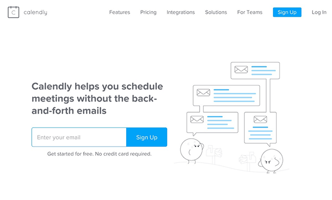
Calendly does an excellent job at demonstrating how you can keep your page clean and to the point. Their message is clear and direct:
Users want to come to your blog and have a sense of ease. Not feel overwhelmed by what you’re sharing. Your blog should be their breathing space.
When you strive for minimalism, you cut out all the unnecessary details. You avoid using too many words, images, and colors. Every part of your design is purposeful and strategic. The content of your page is easy to digest.
Just because your blog is minimal, doesn’t mean that you can’t use things like images, graphics, and video. You just have to make sure that the rest of your page is easy to navigate.
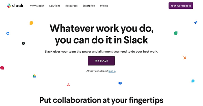
Here Slack makes it easy to navigate the user to their actionable button.
Choosing the minimalism trend also is better for page load time and smaller image sizes.
User experience decisions like minimalism can help push your blog visitors in the right direction and convert them into long term visitors of your blog!
If your blog doesn’t use minimalism in its design, try doing some snipping. Get rid of unnecessary text, images, and videos. Less is more!
Trend 2: Varied fonts and headers
Anyone who has been following the design world recently would see the popular use of heavy fonts.
This year, things are getting even bolder since heavily weighted fonts are being used more regularly.
Below are examples of different weights for fonts, ranging from thin to regular to bold:
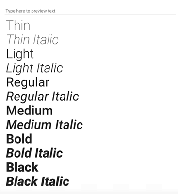
The “heavy” part of fonts is where they have a bold or extra bold appearance.
With the use of these heavy fonts, your blog will come across with a more modern and contemporary feel.
Looking at some big companies and what they’re doing on their ads and websites is very helpful in understanding these trends.
Samsung used big brand fonts in their advertisements last year that is still going strong.

When you play around with heavy fonts you create drama and interest. You can blend in color to have a ton of contrast in your headings.
Look at how Adobe uses heavy fonts in this exact way below:
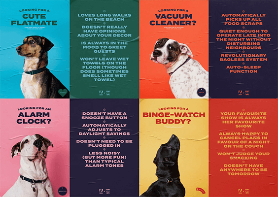
Adobe doesn’t hold back on their dramatic use of fonts in this example.
The contrast of the cute dogs against the font makes this graphic strong and powerful. They also used muted and reserved colors.
You can use heavy fonts for headers and short text to make your information pop!
Here is an example of Chainanalysis using bold fonts for the header only:

According to advertising expert David Ogilvy:
“On the average, five times as many people read the headline as read the body copy.”
The importance of headers is obvious when it comes to guiding readers on your blog. They are able to transition your thoughts and categorize your ideas so they’re easy to follow.
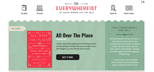
Not only does this blog header by The Everywhereist use heavy font for the header, but also illustrations to emphasize it.
We know that bold fonts add spice to your headings. The question now is, which web fonts are best for your blog?
Most of the examples above have used sans-serif. But your font doesn’t need to be.
Some other popular examples you can use for your blog are:
- Arial
- Veranda
- Georgia
- Lato
A good font has the power to increase your blog traffic, conversions and sales. A bad font can deter readers from accessing your information.
Using a measured approach to selecting your font directs readers in what they should read. So that they’re not scrolling past important information.
Despite heavily encouraging you to use heavy fonts, something important to note is to NOT overuse it. A heavy font will only have the best impact when used mainly for headings or short text.
Trend 3: Using stock images and illustrations
A few years ago, your eyes were basically attacked by the vibrant colors of stock images. Stock photos were edited so heavily.
Bright, bold, and colorful were important factors to having a great stock image. The photos were far from looking realistic and relatable.
With the shift in color trends, came the shift in stock photo trends as well.
Muted, genuine, and neutral stock photos are what are in store for 2020.
In order to have a blog that is visually appealing to your readers, try implementing some of these stock photo inspirations:

Want more photography inspiration? Check out our list of stock photo websites.
If your blog’s theme is muted colors, take the time to tone down the color of your photos as well. This will give it a more authentic and natural feel for your readers.
Stock photos are one way of adding visuals to your blog, but so are illustrations.
Illustrations are crucial for brands to make a lasting and impactful impact on potential readers of your blog. It creates a brand identity.
They create a mood and style for your readers outside of just words.
Although illustrations do require more effort and money, they will have a long term effect on your blog’s branding.
Having your own illustrations will make your blog stand out. This is because no other blog will have the same illustrations that you do.
Casper was one of the first companies to adopt this trend:
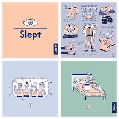
These illustrations use muted colors and attract your eyes so that you engage.
With illustrations, you have so many options. You can use it in your email marketing, your ads, and your blog.
There is a multi use purpose to embracing illustrations and they stand out more than stock photos do. Not to mention how cute and fun they are!
Your visuals are your brand’s story without having to use words. Make them dreamy, imaginative, and abstract so that they are unique and effective.
Overedited, posed or produced photos and illustration will not win the hearts of your readers.
Try to create your own stock photos and illustrations so that they don’t come off as generic on your blog.
Trend 4: Muted color palettes
Popular and trendy colors are not only reserved to fashion.
Bright blues, electric yellows, and toxic greens have all been popular trending colors in design.
It’s important to note that when brands select color, it is purposeful.
Mark Zuckerberg chose blue for Facebook because he is red-green color blind.
Even though his choice wasn’t scientific, it’s important to note that visual sense is the strongest developed sense for most humans. This is why 90% of our assessment in product selection is made by color.
Color is a huge aspect in marketing.
Just as there has been a rise in bold fonts, there has also been a rise in muted colors. This has been effective in brands differentiating themselves from competitors.
Here are some examples of muted colors:
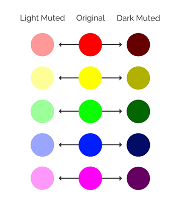
To achieve a muted color, you either infuse it with black or with white. This takes the edge off of the vivid colors.
The LinkedIn Marketing team have been great role models in using muted colors:
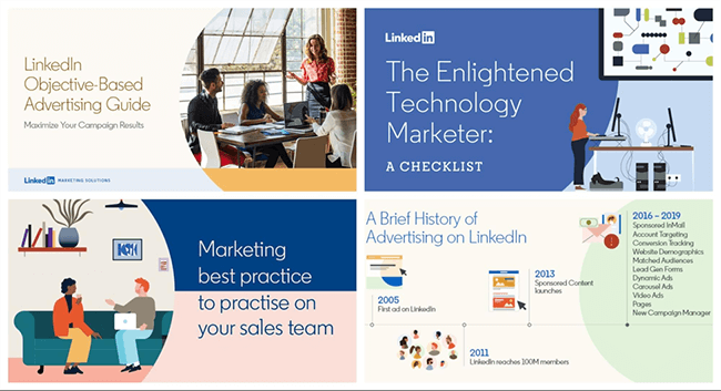
When choosing muted colors for your blog, reflect on your brand. Think about what colors represent the information you’re sharing.
Ellevest does a great job with the colors they chose in their brand representation. They used a white background and complemented it with light muted colors to match. If you choose a black background then a darker muted color works better in the same way.

Using muted colors shouldn’t just be limited to your blog. If you have a product, storefront, or ad you can apply a similar theme.
Using muted colors can make your design feel more natural. If you haven’t updated your blog to reflect muted colors, it’s highly recommended that you do.
Conclusion
As we learned, blogging is one of the most important aspects to your business. Without it your business will not succeed to its full potential.
Using graphic design trends will allow your blog to stand out against your competition. It will have your readers engage with your brand more.
Deciding on the color, illustrations, stock photos, and font of your blog is something that requires dedication and research. It shouldn’t be an impulsive decision.
This is where design trends are important to your blog.
To recap, we looked at the most trendy graphic design trends, here is what we learned:
- Muted colors give a calming effect on your readers.
- Stock photos that are genuine and natural will give a calming effect on your readers.
- Illustrations will tell the story of your brand.
- The right bolded fonts will bring out your headings so that even the least interested will read what you have to say.
Choose the design elements of your blog wisely. And, if you want to make the design process easier, check out our article on the best online graphic design software.

