Color Psychology In Marketing: The Beginner’s Guide
Ever noticed how buy buttons always tend to be red? How reds and yellows are used predominantly in fast food logos? Or how doctors and scientists across the world always wear white lab coats?
Those aren’t just coincidences. They’re deliberate marketing choices, carefully informed by color psychology.
In this beginner’s guide to color psychology in marketing, you will learn how to use the science of color to inform your own marketing decisions.
We’ll be explaining basic color theory, showing you how to choose the right colors for your brand content, and revealing some important consumer color associations that you should be aware of.
Ready? Let’s dive right into it.
What is color psychology in marketing?
Color psychology is a field of study that looks at how colors influence our perceptions and behaviours. When we apply this to marketing, we specifically look at how these colors can influence consumers’ impressions of a brand, and how they impact their purchasing decisions.
By better understanding how the colors we use influence our customers, we can make more well-informed marketing decisions.
Why color psychology matters
Understanding color psychology is crucial to the success of your marketing content. Color is what gets your audience to see what you want them to see, feel what you want them to feel, and to do what you want them to do.
The color choices you make greatly affect the usability of your website and the readability of your content, as well as the perception consumers have of your brand and products and how likely they are to make a purchase.
Get it right, and you can increase your conversions, bolster sales, and improve the success of your marketing content. Get it wrong, and all that great content you’ve spent time and money producing will fall short of the mark. Your customers will be less likely to hit the buy button, and your profits will suffer.
But don’t just take my word for it; take a look at the stats (source: WebFX):
- Consumers subconsciously judge your content in the first 90 seconds, and up to 90% of those people base that judgement on color alone.
- 80% of consumers believe color increases brand recognition.
- 93% of consumers rate visual factors as the most important factors when making a purchase.
- 84.7% of consumers name color as the primary reason they choose a particular product.
Basic color theory (key terminology)
Alright, before we get into the marketing stuff, let’s start with some basic color theory.
There’s a lot to learn – too much to cover in one article – so we’re just going to go over the most important foundations.
Here are the key concepts and terminology you need to be familiar with to keep up from here on out.
Primary colors
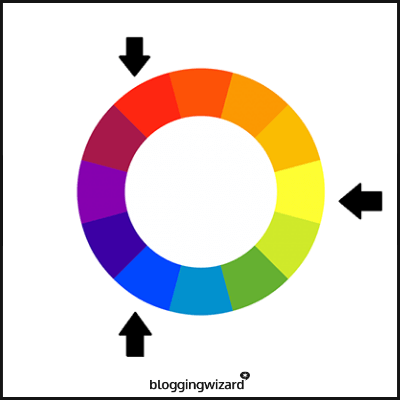
The three primary colors are red, blue, and yellow (or magenta, cyan, and yellow if we’re talking about light). These are the three colors from which we obtain all other colors.
Secondary colors
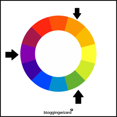
When you mix the primary colors together evenly, you get the three secondary colors: purple, green, and orange. Red and blue make purple; blue and yellow make green, and red and yellow make orange.
Tertiary colors
If you mix primary colors together in uneven ratios or a primary color with a secondary color, you get tertiary colors. For example, if you mix red with blue, but use more red than blue, or red with purple, you get red-purple. All tertiary colors have these hyphenated names, and they’re sometimes called ‘two-name’ colors.
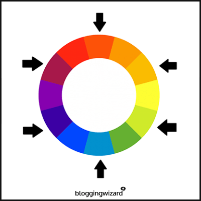
Pure colors
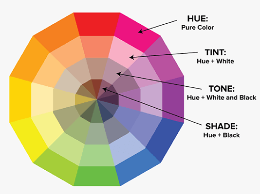
Pure colors are ‘pure’ primary, secondary, or tertiary colors to which we haven’t mixed in any additional colors or black/white. They’re very bright and not-at-all subtle. They’re often used in things like children’s toys.
Tints
A ‘tint’ is a pure color which has been mixed with white. Adding white reduces the intensity of the color and makes it lighter and paler; think pastel colors. The more white you add, the paler the color gets.
Shades
Shades are the opposite of tints – you get them by adding black to a pure color. Adding black into the mix dulls the brightness and creates a darker shade.
Tones
If you add both black and white (i.e. grey) to a pure color, you get a ‘tone’. Creating a tone subdues the intensity of pure colors; it’s where we get the phrase ‘toned down’ from.
Cool/warm colors
You can plot primary, secondary, and tertiary colors, as well as tints, shades, and tones, on a color wheel to show their relationship to each other.
If you cut that color wheel diagonally down the middle you can split it into ‘warm’ colors and ‘cool’ colors. Warm colors include more yellows and reds, whereas cool colors include more blues and greens.
Contrast
The term ‘contrast’ in color theory refers to how distinguishable two colors are from each other. High contrast is when we use two colors that really stand out from each other, whereas low contrast is when we use two colors that don’t. This definition is going to be important later on, so take note.
It’s not so much a difference in color itself that creates contrast as a difference in brightness. Some colors are inherently darker than others (i.e. blue is darker than yellow), but it’s the tone that makes the biggest difference. If two colors have the same tone, they’ll have little contrast.
How to use color psychology in marketing
Ok, now we’re all familiar with the basics of color design theory, let’s get into the good stuff.
Here are some important guidelines on how to use color psychology in marketing.
Match your brand colors to your brand personality
You’ll find a lot of theories floating around online about the ‘best’ brand colors for different kinds of companies based on stereotypical color associations. I’d advise that you take these with a pinch of salt.
The truth is, there’s no easy answer – every brand is different. The right color for your brand will depend largely on context. Factors like what you’re selling, who your customers are, your market positioning, and your competitors all need to be considered first.
However, while there are no hard-and-fast rules as to how to choose colors for your brand, there are some general guidelines to help you to make a practical decision.
The most important of these guidelines is this: the colors you use should show off your brand’s personality.
Based on a framework presented in Dimensions of Brand Personality, there are 5 dimensions to brand personality: sincerity, excitement, sophistication, competence and ruggedness.
Ask yourself which of these best represents the personality you want your brand to portray, and then choose colors that help you to convey that personality.
Here’s an idea of how different colors might match up with those different personality traits:
- Sincerity – Blue / white / pink
- Excitement – Red / orange / yellow
- Sophistication – Black / purple
- Competence – Blue / green / brown
- Ruggedness – Brown
Based on the above, an outdoor clothing brand targeting men that markets itself as tough and rugged would be better off using brown than, let’s say, pink.
However, that isn’t to say that brown is the right choice for all outdoor clothing brands. If your brand is trying to ‘break the mould’ and differentiate itself from entrenched competitors, or if you have a different target market, you might want to go in a different direction.
For example, a ‘luxury’ outdoor clothing brand targeting the high end of the market might use black to connote sophistication.
Use contrast effectively
Contrast is how you make elements on your marketing content and webpages stand out from one another. It’s this that allows you to direct your audience’s attention where you want it and draw them towards certain elements (think buy buttons, sales info, etc.). As such, it’s important to think carefully about contrast when choosing what colors you use on your content.
High contrast (dark on light or light on dark) is usually the best choice to highlight important content that you want to attract your customers’ attention to as it’s the easiest to read. It also makes your customers more likely to notice and remember your most important content thanks to something called the Isolation Effect, which states that items that stick out are more likely to be remembered.
On the other hand, too much high contrast can wear your customers’ eyes out and make your content look too ‘busy’.
Low contrast colors are less easy to read, but they are more aesthetically pleasing and easy on the eyes. That’s why it’s important to get a balance and use a mix of low-contrast and high-contrast techniques across your marketing content. We’ll look at how to do this next.
Choose both complementary and analogous or monochromatic colors
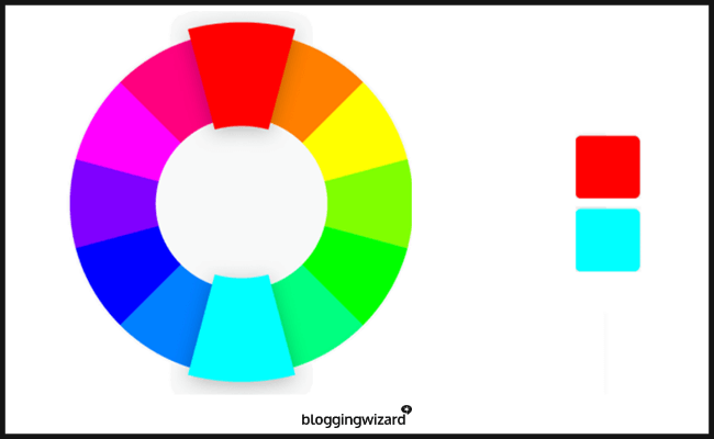
In color theory, complementary colors are those that sit ‘opposite’ each other on a color wheel (e.g. blue-orange, red-green, etc). As such, they’re as visually distinct as possible from each other and thus create a strong contrast.
Analogous colors sit near each other on the color wheel and thus are in low contrast to each other. They’re subtle, don’t stand out from one another, and aren’t jarring on the eyes, hence their popularity amongst designers.
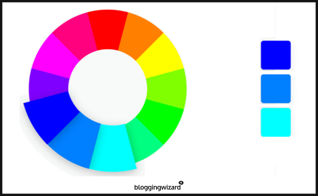
Monochromatic colors are different tints, shades, and tones of a single color. Like analogous colors, they’re low contrast, subtle, and pleasing on the eye.
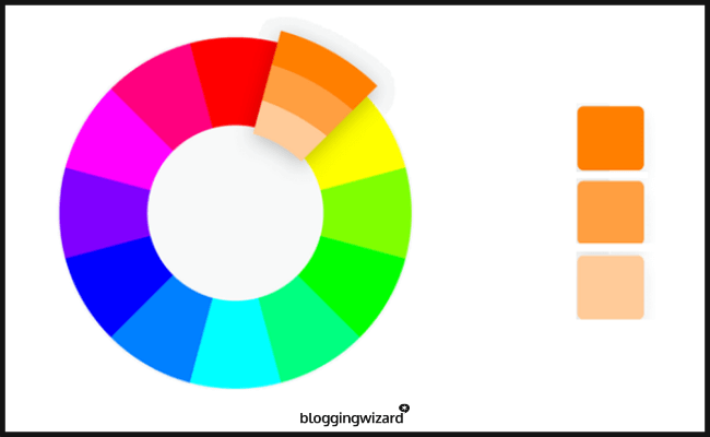
Remember how we said you need to strike a balance between low contrast and high contrast colors? Well, the way you do that is by using a mix of complementary and analogous or monochromatic colors.
A good rule of thumb is to choose a base color and then use analogous or monochromatic for 70% of your content, and complementary colors to your base color for the 30% that you want to stand out.
Keep it simple
One of the biggest mistakes small businesses that don’t consult a professional designer make is to use too many colors in their marketing content. Studies show that most people prefer simple color combinations of just 2-3 colors, so don’t go crazy with your color selection.
Consumers prefer content that is clean and simple. It makes the content easier for them to absorb and doesn’t detract from your message.
Understand the psychology of different colors
There’s been a ton of research into the psychology of different colors, and our subconscious associations with each of them. We can use this research to help us decide which colors to use in our marketing efforts.
These associations are often based on biological factors. For example, there’s a lot of evidence that suggests that red is an appetite stimulant, whereas blue is an appetite suppressant, hence the prevalence of red in restaurant branding.
This is likely due to the fact that, biologically, we’re subconsciously aware that red is a common ‘food color in nature. It’s the color of ripe apples and red meat. Blue, on the other hand, is not a natural food color.
Similarly, green is everywhere in nature, so it makes sense that we associate it with health, organic food, and peace. This is also why it’s such a popular color in the whole foods and health supplement industry.
We don’t have time to go over the psychology of each different color in a great deal of detail here – there are plenty of resources out there that already cover this out there already – but here are a few common color associations to give you an idea.
- Red – Affection, love, terror, fear, survival, energy, strength, aggression, appetite.
- Blue – Trust, dependability, reliability, calmness, trust, distant, cold, unfriendly.
- Green – Balance, harmony, peace, organic, nature.
- Orange – Physical comfort, warmth, shelter, positivity, optimism, enthusiasm, fun..
- Yellow – Joy, happiness, anxiety, excitement, eccentricity.
- Purple – Imagination, spirituality, luxury, mystery.
- Pink – Compassion, love, caring, romance, empathy, immaturity.
- Brown – Security, protection, ruggedness, manliness, boring, reserved.
- Gold – Luxury, wealth, abundance, prosperity, pride, achievement.
- Black – Sophistication, seriousness, evil, mystery, independence, professionalism.
- White – Purity, peace, cleanliness, innocence, calm, simplicity, imagination.
Consider cultural differences
Cultural influences can also impact our perceptions of color. If you’re operating in an international market, make sure you’re aware of the color associations in the countries your customers live in.
For example, in China, red symbolizes luck and prosperity, whereas, in a country like Ireland, luck is more likely to be associated with a color like green or gold. This can have important implications for businesses in the gambling industry, like casinos.
Politics also interacts with our cultural associations with different colors. Take the USA and UK, for example. On the surface, two countries with (comparatively) similar cultures – both western, wealthy, tier-1 countries with predominantly English speaking residents.
However, in the USA, red is the color of the right-leaning republican party, and blue is the color of the more left-leaning democratic party. In the UK, the reverse is true – red is the color of the left-leaning labour party, and blue that of the more right-leaning conservatives.
If your buyers are predominantly liberal, left-leaning customers, red might be a better fit in the UK, whereas blue might be more appropriate in the US.
Split test different color combinations
The best way to figure out if certain color choices are working is by split testing. Split testing involves trialling two different versions of your content in which all elements are the same, except the color, and measuring key metrics to see which color performs better.
Account for color blindness
Statistically speaking, around 4.5% of your customers are likely to be color blind – or even more, if your buyers are primarily male.
Those who suffer from color blindness can struggle to distinguish between certain colors. To make sure your content is accessible for color blind people, make sure there’s high contrast and never rely solely on color to get across information. Include additional text in graphs and images to provide further clarity.
Consider color trends
Before finalizing your branding colors, you may want to consider current color trends.
While you will want to consider all the factors that we’ve discussed previously, color trends can be a useful way to decide on exactly which shades of particular colors you may want to use.
Final thoughts
That concludes this beginner’s guide to color psychology in marketing. As you can see, there’s a lot to learn but, hopefully, this has helped you to get to grips with the basics. Good luck!

